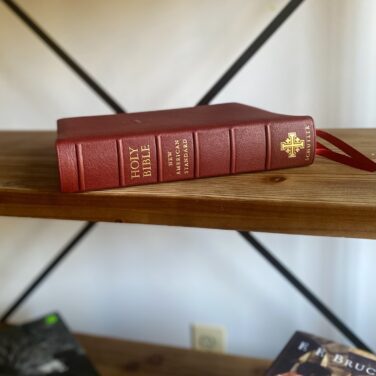
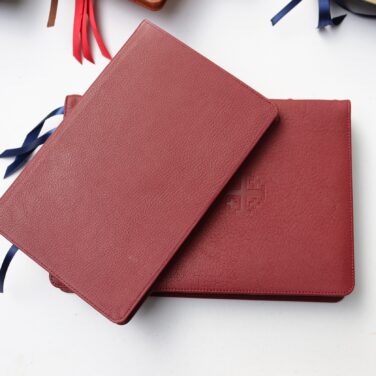
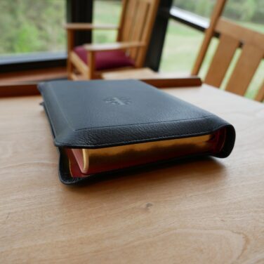
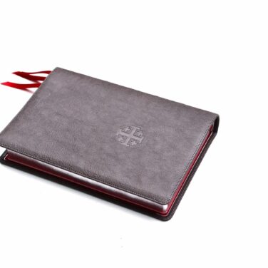
Firebrick Red Goatskin cover and Navy Calfskin liner
3 navy ribbons with blue under silver page edges
Page size: 6.1″ x 9.1″ x 1.1″
11 pt. font with words of Christ in black
Cross references and Concordance
See Descriptionbelow for more details.
Firebrick Red cover with Navy Calfskin lining—pics here
11 point font PDF Sampler of the interior
1995 text
Line Matching
28 GSM Indopaque Paper
Page size: 6.1″ x 9.1″ x 1.1″ (156 x 231 x 29 mm)
16 mm margins
17 mm yapp
3 x 1 cm ribbons (Navy)
Art-Gilt edging (blue under silver) with gilt line (silver line inside the cover)
Smyth Sewn
Black letter text (chapter numbers, headers and page number in red)
More than 95,000 entry cross references and about 17,000 translation footnotes
Presentation and Family Record Pages
Concordance
Schuyler Maps
Reviews
11 reviews for Schuyler Quentel NASB, Firebrick Red Goatskin Bible
Rated 5 out of 5
JC (verified owner)–
Reading my new Quentel is still a joy. After using it for a week and considering some additional factors, I’m supplementing my recent review to add: 1. Significantly, this is the 1995 edition of the NASB, which is what I prefer and wanted. Schuyler’s Stridon NASB is already the newer 2020 NASB revision, so who knows how long the 1995 NASB edition will still be available here. (Perhaps Schuyler will see this and advise.) Note: I’m not saying the 2020 revision is bad, but there are some significant differences, so be aware of which edition you are ordering. I personally much prefer this ’95 edition. Regardless, if you treasure the NASB 1995 translation and want a Quentel or PSQ in the ’95, you might consider grabbing one. 2. I have read (supposedly confirmed by Schuyler, according to that source — ??) that all newly designed text blocks for the Quentels (not additional reprintings of a current text block) will change to 10-pt font size in the future, as the NLT Quentel already is. (I have no idea whether this info is accurate or not!) In any case my eyes like the wonderful 11-pt type size in this current Quentel. Just something else to consider if undecided. This is a wonderful edition of the NASB95! Schuyler, I hope it will not be discontinued even if a newer edition is added in the future. 3. While I’m still disappointed that the color is not the red shown in the photos, if possible I would have deducted only half a star for that, because this Bible is otherwise truly outstanding. These two reviews will average to give a more accurate 4.5-star rating from me, with the color discrepancy. Overall this Quentel is beautiful and top quality and is otherwise 5 stars. 4. All my other 5+ star comments in my earlier review still stand. A week isn’t long, but so far I’ve still noticed only very minimal variation in the darkness of the print. I’m pleased with that, as some of my earlier Schuylers did have some noticeably lighter print in places. I haven’t noticed any defects so far, as to be expected from a premium Bible edition. I’m a big fan of the Quentels and of Schuyler. The smaller PSQs are also very nice hand-sized Bibles if large print isn’t needed. I have a few of each but my eyes now favor the larger Qs.
Rated 4 out of 5
JC –
A beautiful high quality Bible that’s a joy to read, but it’s not red. That’s the reason for deducting a star in order to not mislead anyone who didn’t read the reviews. More on the color at the end. I absolutely love everything else about this Bible, and the rating would be 5+ stars if sold as something like a burgundy. Unlike a few of my earlier Schuylers, I haven’t yet noticed any portions of text that are printed lighter than others. The line matching is good and there is very little ghosting. No creased pages. The goatskin is wonderful, very supple with a fine pebble grain, and the Bible lies open from any place. The calfskin liner and art gilding are perfect, and I love the blue-under-silver with the “red”/burgundy cover; nice contrast and no clashing of reds. And of course the large print is wonderful for less than perfect eyes while the Bible is still easy to hold. I took it to church today. TL;DR re the current “Firebrick Red” color: Several years ago I bought an ESV PSQ in Firebrick Red to gift, and it was a beautiful deep, rich true red. That was the color I was expecting to get. While the photo doesn’t appear (on my laptop) quite as true a red as the earlier ESV, it’s much more red than the Bible I just received. It’s a stretch to even call this NASB Quentel “red.” In some light it is a nice burgundy; in other light it is some kind of dark brownish?/bluish? reddish color. It’s still a beautiful Bible overall and is a more conservative “red” which some might prefer, but I don’t. I feel petty deducting a star, but 5 stars would imply everything was just as expected for a premium Bible. Some other reviewers have had the same color complaint. Perhaps the color name should be changed for this printing run? I still highly recommend this wonderful edition of the Bible, but be aware the color is no longer a true rich red or as shown. That said, we are blessed to have these heirloom-quality Bibles available to us from Schuyler in several excellent translations.
Rated 5 out of 5
Sheaffergirl –
I purchased two of these NASB Quentel Bibles for gifts. I really loved the silverline blue on the firebrick red, and personally like the silverline blue on the Bible’s rather than the red and gold gilt. The only difference I noticed between this NASB Quentel and the ESV Quentel I purchased in 2017 was the size; my ESV is much heavier, and I believe it has 28 GSM paper. Is there a different paper supplier? But personally, I really loved the Firebrick Red with silverline blue Quentel and wouldn’t mind someone gifting me one, lol. These quality Bibles are a joy to own, in my opinion, and I feel blessed to have my own Quentel. Thank you, EB, for selling these quality Bibles.
Rated 4 out of 5
Billy Jordan –
This is an update to my review on April 15, 2021. I just discovered that the color I received can now be seen on evangelical’s website. If you take a look at the picture describing the Quentel NASB Firebrick Red FULL YAPP Bible, this is the color I received instead of the cherry red color depicted on the regular Quentel Firebrick Red Bible. I do not know why the cherry red Bible is listed there if that isn’t the one sent out when ordered, but, to me, it is a disappointment as well as being misleading. Perhaps evangelicalbible should replace the photo of the cherry red Bible with the correct color.
Rated 4 out of 5
Billy Jordan –
I just received this Firebrick Red NASB after much eager anticipation. From the description given, this Bible was everything I wanted in a premium Bible, including the color shown on this website. Ever since the late ’60s, I have wanted to carry with me a Bible like the one that the Rev. Bob Harrington, known as the Chaplain of Bourbon Street in New Orleans, did. His “Sword” was like a cherry red color, which he deliberately chose because it reminded him of the blood of Jesus Christ. I so greatly admired his testimony and the ministry he had right down in the heart of New Orleans, and this was my inspiration for always wanting a Bible like he had. So, today, I unboxed this NASB and after removing the bubblewrap and other packing materials, there it was which led to my mouth dropping open……in disbelief! I cannot begin to tell you how much I looked forward to getting this Bible in the color that is depicted on the website, but, alas, it was not meant to be. To me, the color here on the website is what I would call either “cherry red” or “candy apple red.” This Bible, as good as everything else about it can be, is neither. To be fair, the color is in the red family but nowhere close to the color shown here. In fact, I cannot even think of anything else to liken it to so that you, as future purchasers, can refer to. Be that as it is, the color IS acceptable, not ugly, and I am keeping it because of the superior attributes of the Bible itself. Get it, you won’t be disappointed, but just don’t expect it to be the color as shown on the website. Be blessed, and BE a blessing!
Rated 5 out of 5
Jack –
To Ed Bowlin,
Schuyler is coming out with an NASB wide margin SOON. Just check the info page on Evangelical bibles information forum. It’s coming!
Rated 2 out of 5
Ed Bowlin –
I am extremely displeased with my new NASB Quentel Bible. I am getting older and was finding it harder to read my Cambridge Wide-Margin NASB, so I bought this one. I think it is a horrible reading bible. The paper is way too thin, which makes the bleed through awful, even though the bible is line-matched. You have to hold the page away from the other pages to clear up the bleed through. My Cambridge on the other hand, with only an 8 point font, is easer to read than this bible. It is a shame, because as far as build quality goes, it is close to Cambridge’s quality. This bible should be advertised as a thin-line bible, because customers expect these problems with bleed through with a thin line.
Rated 5 out of 5
Tereasa Hilliard –
My Christmas Bible from evangelicalbible is a absolute delight! What a great present to myself. I found my Bible in the slightly imperfect section and saved some money by choosing it. This Christmas season has been a Schulyer Bible Christmas for my friends.
My friends have never owned such a lovely Bible until now. They seem very pleased with a Blue Credo Canterbury and the other friend is receiving a NKJV Quentel.
Anyway I just wanted to spread the Joy of owning a Bible that will last generations.
My Firebrick RED NASB is so much fun to read! I will be reading it cover to cover. The print is bold. The cover feels delightful in my rather small hands. Perfect size and light weight. I am so glad that Schulyer put the concordance inside this edition. I would not have bought a NASB Schulyer without it. The colors are cheerful and I love the silver with blue art gilt.
I wish Schulyer a long and happy business. Thanks for my Christmas Bible. You made my Christmas!!! God Bless and happy reading.
Rated 5 out of 5
Abigail Hortencia –
Firebrick red KJV wide margin canterbury nice bible concordance a little small color combunation maps paper awesome
Rated 5 out of 5
David Gustafson –
Love this color combination! The only way to make this Bible better is to have it in the credo version… Whereas I prefer my ESV credo, blue leather with blue under silver, This firehouse red NASB with blue under silver is my next favorite… waiting for the credo version… Love Schuyler Bibles!
Rated 5 out of 5
jeffreyjrobarge –
This Bible is beautifully put together. The craftsmanship is lovely. The Schuyler Quentel in my opinion is one of the best out there when it comes to premium. Such a pleasure to read Gods word. Go ahead and add it to your cart if you are able you will not be disappointed.


JC (verified owner) –
Reading my new Quentel is still a joy. After using it for a week and considering some additional factors, I’m supplementing my recent review to add: 1. Significantly, this is the 1995 edition of the NASB, which is what I prefer and wanted. Schuyler’s Stridon NASB is already the newer 2020 NASB revision, so who knows how long the 1995 NASB edition will still be available here. (Perhaps Schuyler will see this and advise.) Note: I’m not saying the 2020 revision is bad, but there are some significant differences, so be aware of which edition you are ordering. I personally much prefer this ’95 edition. Regardless, if you treasure the NASB 1995 translation and want a Quentel or PSQ in the ’95, you might consider grabbing one. 2. I have read (supposedly confirmed by Schuyler, according to that source — ??) that all newly designed text blocks for the Quentels (not additional reprintings of a current text block) will change to 10-pt font size in the future, as the NLT Quentel already is. (I have no idea whether this info is accurate or not!) In any case my eyes like the wonderful 11-pt type size in this current Quentel. Just something else to consider if undecided. This is a wonderful edition of the NASB95! Schuyler, I hope it will not be discontinued even if a newer edition is added in the future. 3. While I’m still disappointed that the color is not the red shown in the photos, if possible I would have deducted only half a star for that, because this Bible is otherwise truly outstanding. These two reviews will average to give a more accurate 4.5-star rating from me, with the color discrepancy. Overall this Quentel is beautiful and top quality and is otherwise 5 stars. 4. All my other 5+ star comments in my earlier review still stand. A week isn’t long, but so far I’ve still noticed only very minimal variation in the darkness of the print. I’m pleased with that, as some of my earlier Schuylers did have some noticeably lighter print in places. I haven’t noticed any defects so far, as to be expected from a premium Bible edition. I’m a big fan of the Quentels and of Schuyler. The smaller PSQs are also very nice hand-sized Bibles if large print isn’t needed. I have a few of each but my eyes now favor the larger Qs.
JC –
A beautiful high quality Bible that’s a joy to read, but it’s not red. That’s the reason for deducting a star in order to not mislead anyone who didn’t read the reviews. More on the color at the end. I absolutely love everything else about this Bible, and the rating would be 5+ stars if sold as something like a burgundy. Unlike a few of my earlier Schuylers, I haven’t yet noticed any portions of text that are printed lighter than others. The line matching is good and there is very little ghosting. No creased pages. The goatskin is wonderful, very supple with a fine pebble grain, and the Bible lies open from any place. The calfskin liner and art gilding are perfect, and I love the blue-under-silver with the “red”/burgundy cover; nice contrast and no clashing of reds. And of course the large print is wonderful for less than perfect eyes while the Bible is still easy to hold. I took it to church today. TL;DR re the current “Firebrick Red” color: Several years ago I bought an ESV PSQ in Firebrick Red to gift, and it was a beautiful deep, rich true red. That was the color I was expecting to get. While the photo doesn’t appear (on my laptop) quite as true a red as the earlier ESV, it’s much more red than the Bible I just received. It’s a stretch to even call this NASB Quentel “red.” In some light it is a nice burgundy; in other light it is some kind of dark brownish?/bluish? reddish color. It’s still a beautiful Bible overall and is a more conservative “red” which some might prefer, but I don’t. I feel petty deducting a star, but 5 stars would imply everything was just as expected for a premium Bible. Some other reviewers have had the same color complaint. Perhaps the color name should be changed for this printing run? I still highly recommend this wonderful edition of the Bible, but be aware the color is no longer a true rich red or as shown. That said, we are blessed to have these heirloom-quality Bibles available to us from Schuyler in several excellent translations.
Sheaffergirl –
I purchased two of these NASB Quentel Bibles for gifts. I really loved the silverline blue on the firebrick red, and personally like the silverline blue on the Bible’s rather than the red and gold gilt. The only difference I noticed between this NASB Quentel and the ESV Quentel I purchased in 2017 was the size; my ESV is much heavier, and I believe it has 28 GSM paper. Is there a different paper supplier? But personally, I really loved the Firebrick Red with silverline blue Quentel and wouldn’t mind someone gifting me one, lol. These quality Bibles are a joy to own, in my opinion, and I feel blessed to have my own Quentel. Thank you, EB, for selling these quality Bibles.
Billy Jordan –
This is an update to my review on April 15, 2021. I just discovered that the color I received can now be seen on evangelical’s website. If you take a look at the picture describing the Quentel NASB Firebrick Red FULL YAPP Bible, this is the color I received instead of the cherry red color depicted on the regular Quentel Firebrick Red Bible. I do not know why the cherry red Bible is listed there if that isn’t the one sent out when ordered, but, to me, it is a disappointment as well as being misleading. Perhaps evangelicalbible should replace the photo of the cherry red Bible with the correct color.
Billy Jordan –
I just received this Firebrick Red NASB after much eager anticipation. From the description given, this Bible was everything I wanted in a premium Bible, including the color shown on this website. Ever since the late ’60s, I have wanted to carry with me a Bible like the one that the Rev. Bob Harrington, known as the Chaplain of Bourbon Street in New Orleans, did. His “Sword” was like a cherry red color, which he deliberately chose because it reminded him of the blood of Jesus Christ. I so greatly admired his testimony and the ministry he had right down in the heart of New Orleans, and this was my inspiration for always wanting a Bible like he had. So, today, I unboxed this NASB and after removing the bubblewrap and other packing materials, there it was which led to my mouth dropping open……in disbelief! I cannot begin to tell you how much I looked forward to getting this Bible in the color that is depicted on the website, but, alas, it was not meant to be. To me, the color here on the website is what I would call either “cherry red” or “candy apple red.” This Bible, as good as everything else about it can be, is neither. To be fair, the color is in the red family but nowhere close to the color shown here. In fact, I cannot even think of anything else to liken it to so that you, as future purchasers, can refer to. Be that as it is, the color IS acceptable, not ugly, and I am keeping it because of the superior attributes of the Bible itself. Get it, you won’t be disappointed, but just don’t expect it to be the color as shown on the website. Be blessed, and BE a blessing!
Jack –
To Ed Bowlin,
Schuyler is coming out with an NASB wide margin SOON. Just check the info page on Evangelical bibles information forum. It’s coming!
Ed Bowlin –
I am extremely displeased with my new NASB Quentel Bible. I am getting older and was finding it harder to read my Cambridge Wide-Margin NASB, so I bought this one. I think it is a horrible reading bible. The paper is way too thin, which makes the bleed through awful, even though the bible is line-matched. You have to hold the page away from the other pages to clear up the bleed through. My Cambridge on the other hand, with only an 8 point font, is easer to read than this bible. It is a shame, because as far as build quality goes, it is close to Cambridge’s quality. This bible should be advertised as a thin-line bible, because customers expect these problems with bleed through with a thin line.
Tereasa Hilliard –
My Christmas Bible from evangelicalbible is a absolute delight! What a great present to myself. I found my Bible in the slightly imperfect section and saved some money by choosing it. This Christmas season has been a Schulyer Bible Christmas for my friends.
My friends have never owned such a lovely Bible until now. They seem very pleased with a Blue Credo Canterbury and the other friend is receiving a NKJV Quentel.
Anyway I just wanted to spread the Joy of owning a Bible that will last generations.
My Firebrick RED NASB is so much fun to read! I will be reading it cover to cover. The print is bold. The cover feels delightful in my rather small hands. Perfect size and light weight. I am so glad that Schulyer put the concordance inside this edition. I would not have bought a NASB Schulyer without it. The colors are cheerful and I love the silver with blue art gilt.
I wish Schulyer a long and happy business. Thanks for my Christmas Bible. You made my Christmas!!! God Bless and happy reading.
Abigail Hortencia –
Firebrick red KJV wide margin canterbury nice bible concordance a little small color combunation maps paper awesome
David Gustafson –
Love this color combination! The only way to make this Bible better is to have it in the credo version… Whereas I prefer my ESV credo, blue leather with blue under silver, This firehouse red NASB with blue under silver is my next favorite… waiting for the credo version… Love Schuyler Bibles!
jeffreyjrobarge –
This Bible is beautifully put together. The craftsmanship is lovely. The Schuyler Quentel in my opinion is one of the best out there when it comes to premium. Such a pleasure to read Gods word. Go ahead and add it to your cart if you are able you will not be disappointed.