Schuyler Stridon NASB, Imperial Blue Goatskin Bible
Original price was: $205.00.$190.00Current price is: $190.00.
In stock
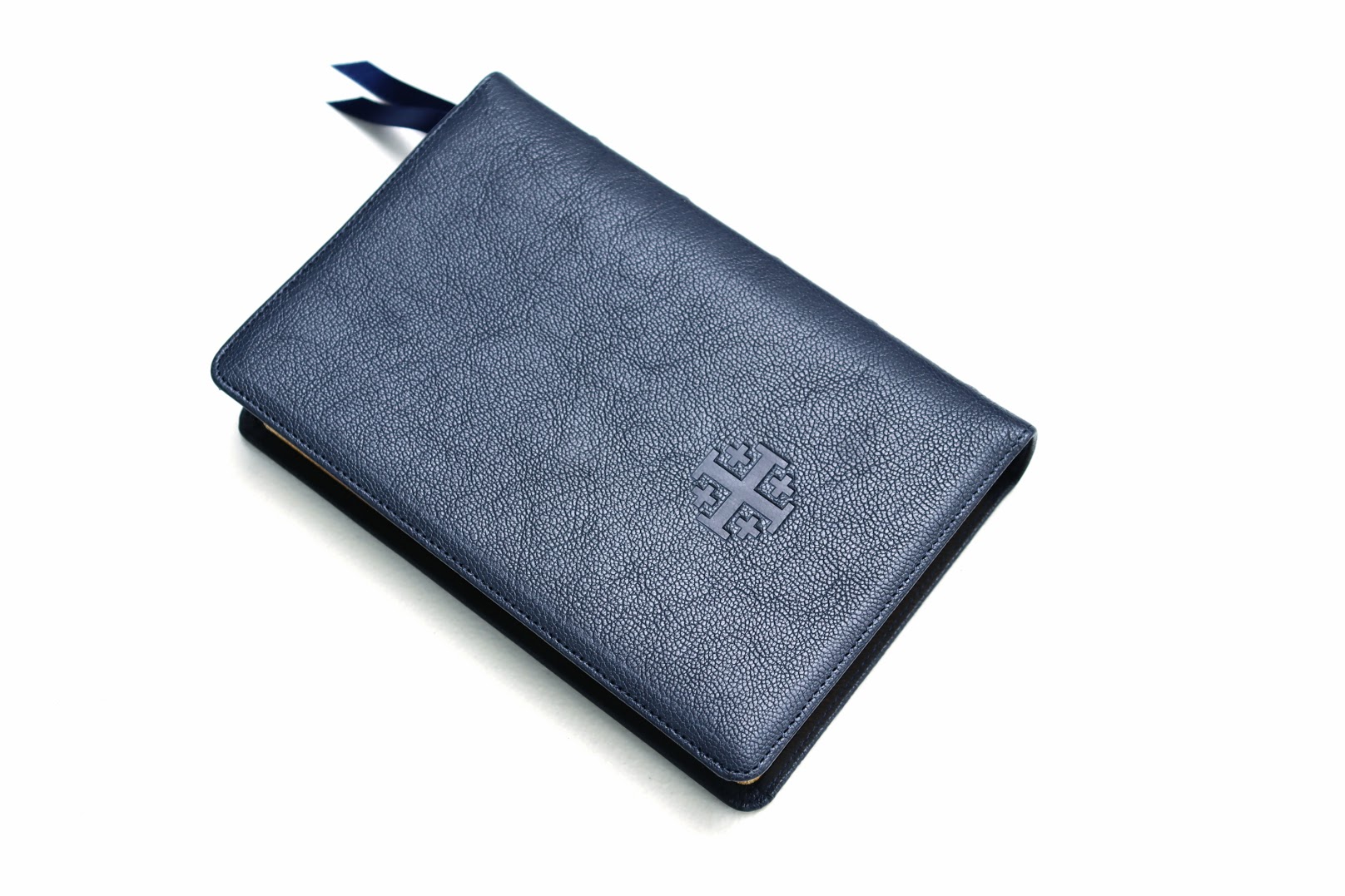
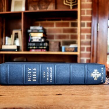
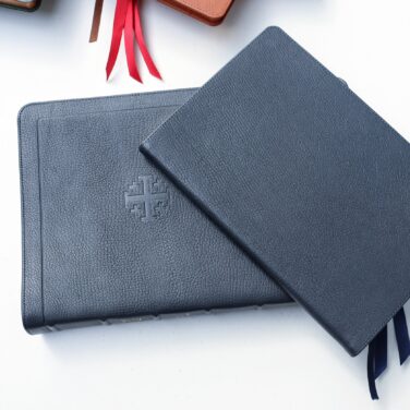
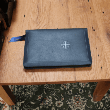
Imperial Blue Goatskin cover with Navy Calfskin liner
3 navy ribbons and blue under gold art gilt
Page size: 6.1″ x 9.1″ x 1.3″
10 pt. font with words of Christ in black
Cross references and Concordance
See Description below for more details.
- Description
-
Description
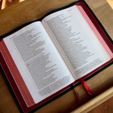
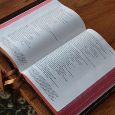
The Schuyler Stridon is a new and unique presentation of the NASB text. Here is a PDF sampler. Here are pictures. This single column, verse-by-verse typesetting is framed with wide outer margins. Cross references and footnotes are separated at the bottom of the page for ease of use.
Imperial Blue Goatskin Covers with Navy Calfskin Lining
10 point font
NASB 2020 text
Trim size: approximately 6.1″ x 9.1″ x 1.3″ (156 mm x 232 mm x 33 mm)
Line Matching
Single column, verse by verse layout
28 GSM Indopaque Paper
~1 inch outer margins
9 mm yapp
3 x 1 cm ribbons (Navy)
Art-Gilt edging (blue under gold) with gilt line (gold line inside the cover)
Smyth Sewn
Black letter text
More than 95,000 cross references and the full set of translation footnotes
Presentation and Family Records Pages
Concordance
Schuyler Maps - Reviews
-
9 reviews for Schuyler Stridon NASB, Imperial Blue Goatskin Bible
Jeremiah Chuiha (verified owner) –
I received my Imperial Blue Stridon a few days ago, and I love it. It is beautiful indeed. I hope I will use it for years preaching. Btw, Shipping is so fast, too. I really appreciate it. I wish to receive Schuyler Stridon NASB With red text verse by verse in near future unboxing to review.
Ben Hegan (verified owner) –
An exceptional Bible. I love my copy of this Bible and use it often. The single column verse by verse layout is very well designed and easy to read. The typesetting is very aesthetically pleasing. I love the quality and care that clearly goes in to making Schuyler Bibles. This will be a regularly used Bible for years to come. Highly recommended!
Evan Drago –
I really do enjoy this bible. The layout of the text is very pleasant. The look and feel of the leather as well as the pages is fantastic. I don’t have any cons. I did find some printing errors but nothing big. Some text is closer together and some letters bold. Only thing I did find also is I have a phillippians ch5. Even though it’s ch4 text. And it only says phillipians 5 on the top of the page not actually in scripture. Other than that I’ve enjoyed this book. I would love to see it done and purchase a 1995 NASB in this exact stridon layout.
Youssef Ramses –
Regretfully the two color reference system, which was intended as an improvement in the Stridon design has proven to be a source of unacceptable misalignment defects. The explanation given to me was that, since the red ink is put dawn first followed by the black ink, the slightest shift in the paper during printing causes misalignments. To add insult to injury, such misalignment variations are not considered a defect except if: not only the red and black colors overlap ! But also that the text is unreadable
I contacted Evangelical and they thankfully gave me the choice either to return and refund the full price of the Bible (without customs nor shipping costs to and from Egypt which exceeded $ 100 ) or to get a refund of onetime $30.
Since I am a collector of Schuyler (big font) versions I preferred a credit advice to use for buying the coming NLT but was obliged to get a refund because of a software problem.
I confess My being a perfectionist and the extremely high expectations from both the Evangelical premium Bibles and the publisher, could have had an effect on my frustration from such misalignments but really they are completely unacceptable on many many pages. If I could share photos I would have but this feature is not available.
ann mcmahon –
The Stridon is a wonderful and easy to read text block. The setting of the translator notes at the bottom next to the references make it easy to navigate through.The larger print NASB concordance is also a huge improvement over the much smaller printed Quentel concordance. It is a win win overall!
Doug Sowter –
I got mine on Tuesday it is even more magnificent then I expected.
Walter –
I received my Imperial Blue Stridon a few days ago. Last night was the first time I had an opportunity to relax and take my time opening and inspecting the bible.
I am so impressed with this bible from the construction to the text block. All first rate. I have been blessed with an understanding wife, and the ability to acquire almost all of the Schuyler NASB bibles that have been produced. With the exception of the 2nd printing of the Quentel with 36 GSM paper. I feel this is the best one yet in my opinion. The only nit picking that I can say is my older eyes have a harder time with the footnotes, then some of the others. This is my first N ASB 2020, so I am going to attempt to read through the bible to make up my own mind on the changes made with this new revision. So far I can see that the changes made, are to make the reading clearer for the person and haven’t been to the detriment of the meaning or theme.
In conclusion I can see this bible becoming my daily reader.
Doug Sowter –
Ordered mine today will arrive Tuesday I am so stoked!!!
Gerad Griffith –
Duplicate.
The Bible its self is beautiful! The type setting is just the right font and I’m looking forward to using for years.