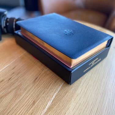
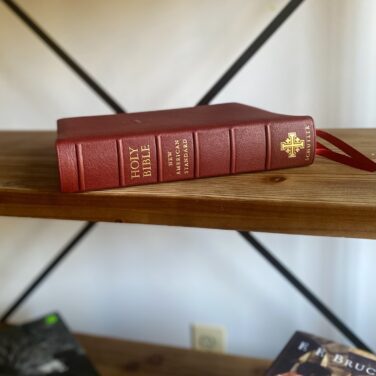
Full Yapp Imperial Blue Goatskin cover with Navy Calfskin liner
3 navy ribbons and blue under gold art gilt
Page size: 5.5″ x 8.5″ x ~1.1″
10 pt. font with words of Christ in red
Concordance
See Descriptionbelow for more details.
The Treveris is a unique new typesetting from Schuyler that seeks to give the Bible reader a format that is free of human commentary, i.e. without subheadings, references, etc., but at the same time remains practical for Bible study. The text itself is free from callers, subheadings, and numbers, but verse and chapter designations are available in the margins, with subheadings in the header.
Features:
Full Yapp Imperial Blue Natural Grain Goatskin Cover, Navy Calfskin Liner, 3 Navy Ribbons – pics here
See a PDF sampler of the text here
Trim Size: 5.5″ x 8.5″ x ~1.1″ (140mm x 215mm x ~28mm)
28 GSM Paper
Font: 10 pt.
Single Column Paragraph format
Single Column, Verse-by-Verse format for Psalms, Proverbs, Song of Solomon, Poetry, and Quotations
Ornamental Drop Caps
Red letter Italics for supplied words
Epistle Dedicatory & Translators to the Readers
Concordance
Line Matching to avoid “see through”
Art Gilt Edging (blue under gold)
Lined Bible paper in the back
Schuyler Bible Maps
Reviews
9 reviews for Schuyler Treveris KJV, Full Yapp Imperial Blue Goatskin Bible
Something Old – The text uses dropdown capital letters in a beautiful red box to start each chapter. This really gives this Bible the feel of something old – an elegant presentation of God’s word. The craftsmanship also feels old-world, when books and Bibles took time and care to produce. With the verse numbers to the side they go almost unnoticed leaving the reader, at least this reader, with the impression of what it must have been like when believers of old read illuminated manuscripts. It truly is refreshing.
Something New – The typesetting is by 2K/Denmark and the paper comes from France. The font is 10pt and is very easy on the eyes, both in appearance and my tired older eyes. The words of Christ are in red and the Bible comes with three ribbons, and with blue under gold art gilt.
Something Borrowed – The cover has borrowed the Jerusalem Cross imprinted on the front and side (a trademark of Schuyler Bibles), representing Christ and the four Gospels. One of the qualities of this premium Bible is that it is goatskin, making it feel very soft and inviting. This Bible falls open and stays open wherever you are reading.
Something Blue – The Imperial Blue Goatskin is absolutely gorgeous. Depending on the lighting, the blue sometimes dark with a hint of gray, and sometimes bright and Royal, thus living up to its name.
This is simply a wonderful and beautiful Bible. You should get one for yourself, and perhaps another one as a memorable wedding gift. It certainly lives up to the poem, and everything I’ve come to expect from Schuyler Bibles.
Rated 5 out of 5
thomasjoshua5 –
What a beautiful single-column, paragraph layout KJV! This is the perfect readers Bible. You can almost get lost when you’re reading it, as it feels like you’re reading a novel, which is made better by the fact that you’re reading God’s Holy Word! Having the verse numbers in the margin makes the reading experience even better, as you’re not distracted by anything within the text itself.
I’ve come to realise how much I love paragraph Bibles, as opposed to verse-by-verse ones, so this is the perfect Bible for really reading God’s Word.
Of course, the blue under gold art gilding, the 3 blue ribbons, the drop caps, the blue Goatskin cover, the paper, the full yapp, the concordance and maps altogether makes this a wonderful Bible by Schuyler. This is my 2nd Bible from Schuyler and I’m really impressed by their craftsmanship.
Rated 5 out of 5
George Barlow –
Lovely Bible. The workmanship is top notch. It is a pleasure to use. The only slight negative for me is the thinness of the paper. The paper is premium, but I wish it could have been a heavier gsm as there is some show through in places. All the premium Bibles that use this paper have this issue. Overall though I absolutely love it
Rated 5 out of 5
Delver –
I have had this Bible for about a month now. It is hard to objectively review something like this as the things that I am not a fan of are aesthetics or preferences.
I love the single column without references or notes and the verse numbers outside the text. In today’s day and age, if I want to dig deeper I will just use other reference books or online resources. Having cross-references and footnotes in the text just aren’t needed unless that is how you prefer to study. So I could do without the concordance in this edition as well as the maps. I love maps, but there are resources that provide better functionality and more information than both of these additions (physical and online media).
I love the typesetting. The drop capitals are a beautiful and provide just enough indication of a new chapter without being distracting, but if you want a pure readers Bible, you might find them distracting. (sometimes I stop reading to examine them. I suppose that will lessen with time.) I like having that little bit of notice for a new chapter and do not find it too distracting. I have no issues finding verses.
The physical construction is really nice. I am not picky about colors. I like the imperial blue. It is an understated blue. I like the blue art gilding as well. There is something nostalgic about it for me, though I don’t know why. The binding is amazing, but it is hard to talk about the quality of binding construction before a few decades have past. But for a new $200 Bible it is what I would expect.
Negatives for me:
The paper is very nice, but far too thin for my preference. It makes turning pages difficult. Perhaps I need to slow down, but with a “readers” Bible fumbling to try to turn one and only one page for 15 seconds and creasing the pages as I do is distracting. I am not too concerned about the wear and tear, but it knocks me out of the Bible reading mindset. I would like to have something a little thicker for ease of turning. I don’t write in my Bible as of yet, so I cannot speak to that.
I don’t now if it is possible with a Bible of this size, but I’d prefer 4 ribbons. I have 2 ribbons in the New Testament and it would be nice to have 2 in the Old Testament. But then, if I had 4, I’d probably want 5.
I am not a huge fan of gilding. In Schuyler’s credit, the cross on the front is not gilded, and it does not say “HOLY BIBLE” in gilding across the front cover like most others. That matches my aesthetics much better that other Bible manufacturers. The gilding on the spine is not too gaudy, but I am thinking about removing it. I’d prefer the spine pressing to be “ghosted” (not sure the terminology) like the cross on the front cover. But then I can understand why a Bible manufacturer would want their logo as readable as possible. For the page edges, I like the blue and I wish it was blue without the gilding over top. But I’d prefer natural color edges. As I said above, the blue is nice, and it is definitely something that has grown on me.
So the negatives are just aesthetics and preferences, which makes it hard to give a star rating. I’d probably give a 4 or 4 1/2, but for the revitalization of my Bible reading and time spent in the word, as well as it’s beauty and feel, and no dings on quality and workmanship, I will give it 5. It doesn’t feel right knocking it down to 4 for subjective reasons.
Rated 5 out of 5
Tim –
Love the Treveris edition of the KJV. It has actually brought me “full circle” to reading the “Authorized Version” regularly. Also purchased the Treveris ESV full yapp. Both are wonderful. Great job Schuyler!
Rated 5 out of 5
Joseph –
This is the first premium Bible I’ve owned, so I don’t have anything to compare it, too. I can’t imagine there is anything to compare this, too though. Imperial Blue wasn’t my first choice, but they sold out of the other color I was considering before I ordered. But let me tell you, I’m glad they did. This blue is beautiful in person! The goatskin is very soft with a nice grain and texture. In addition to being my first premium, this is also my first KJV, which is why I was drawn to this. I’ve mainly read NLT, so the single column paragraph format is what I’m used to. The text is so easy to read! The font size and darkness is perfect. The text is completely clean and free of anything to interrupt your reading. No verse numbers, references, or pronunciation. I only wish it had been offered with blue under silver art gilding, but the blue under gold is still beautiful! And the gold is very subtle, anyway. If you’re looking for a great way to be immersed in your reading, you’ve found it with the Treveris. An NKJV to go along with this would be phenomenal!
Rated 5 out of 5
Teresa Sprowl –
This is my favorite Bible that I’ve ever owned! I love that it is text only and in paragraph format. Love the font, it is so comfortable to the eyes and my eyes don’t get fatigued. I have the Imperial Blue and the whole Bible is beautiful from front to back. It’s a great size and is comfortable holding while reading. All around great experience; I have no complaints. Thank you Schuyler for a fantastic Bible!
Rated 5 out of 5
jackv –
Pound per pound, overall this (blue) KJV Treveris is the greatest bible to ever be published in our modern times.
Whether you are seeking simplicity, portability, or readability you will find those great attributes in this well conceived bible. The remarkable print of the font is a bold, clear, and perfect size for the single column pagination.
By not having self pronouncing words, references, notes, nor maps make this a wonder to read for pages on end.
The conventional bible set-up is good as a bachelors degree but for those who seek to attain a doctorates the Treveris is sure to elevate your meditation experience of the word in the greatest book of all time.
Amen.
Rated 5 out of 5
jorge-6379 –
I love this bible very immersive reading experience and the 10 pt font is very readable in this edition. I hope in the future an 11 pt font edition would also available.


tom-8916 (verified owner) –
“Something Old, Something New,
Something Borrowed, Something Blue”
This Bible reminded me of this wedding poem.
Something Old – The text uses dropdown capital letters in a beautiful red box to start each chapter. This really gives this Bible the feel of something old – an elegant presentation of God’s word. The craftsmanship also feels old-world, when books and Bibles took time and care to produce. With the verse numbers to the side they go almost unnoticed leaving the reader, at least this reader, with the impression of what it must have been like when believers of old read illuminated manuscripts. It truly is refreshing.
Something New – The typesetting is by 2K/Denmark and the paper comes from France. The font is 10pt and is very easy on the eyes, both in appearance and my tired older eyes. The words of Christ are in red and the Bible comes with three ribbons, and with blue under gold art gilt.
Something Borrowed – The cover has borrowed the Jerusalem Cross imprinted on the front and side (a trademark of Schuyler Bibles), representing Christ and the four Gospels. One of the qualities of this premium Bible is that it is goatskin, making it feel very soft and inviting. This Bible falls open and stays open wherever you are reading.
Something Blue – The Imperial Blue Goatskin is absolutely gorgeous. Depending on the lighting, the blue sometimes dark with a hint of gray, and sometimes bright and Royal, thus living up to its name.
This is simply a wonderful and beautiful Bible. You should get one for yourself, and perhaps another one as a memorable wedding gift. It certainly lives up to the poem, and everything I’ve come to expect from Schuyler Bibles.
thomasjoshua5 –
What a beautiful single-column, paragraph layout KJV! This is the perfect readers Bible. You can almost get lost when you’re reading it, as it feels like you’re reading a novel, which is made better by the fact that you’re reading God’s Holy Word! Having the verse numbers in the margin makes the reading experience even better, as you’re not distracted by anything within the text itself.
I’ve come to realise how much I love paragraph Bibles, as opposed to verse-by-verse ones, so this is the perfect Bible for really reading God’s Word.
Of course, the blue under gold art gilding, the 3 blue ribbons, the drop caps, the blue Goatskin cover, the paper, the full yapp, the concordance and maps altogether makes this a wonderful Bible by Schuyler. This is my 2nd Bible from Schuyler and I’m really impressed by their craftsmanship.
George Barlow –
Lovely Bible. The workmanship is top notch. It is a pleasure to use. The only slight negative for me is the thinness of the paper. The paper is premium, but I wish it could have been a heavier gsm as there is some show through in places. All the premium Bibles that use this paper have this issue. Overall though I absolutely love it
Delver –
I have had this Bible for about a month now. It is hard to objectively review something like this as the things that I am not a fan of are aesthetics or preferences.
I love the single column without references or notes and the verse numbers outside the text. In today’s day and age, if I want to dig deeper I will just use other reference books or online resources. Having cross-references and footnotes in the text just aren’t needed unless that is how you prefer to study. So I could do without the concordance in this edition as well as the maps. I love maps, but there are resources that provide better functionality and more information than both of these additions (physical and online media).
I love the typesetting. The drop capitals are a beautiful and provide just enough indication of a new chapter without being distracting, but if you want a pure readers Bible, you might find them distracting. (sometimes I stop reading to examine them. I suppose that will lessen with time.) I like having that little bit of notice for a new chapter and do not find it too distracting. I have no issues finding verses.
The physical construction is really nice. I am not picky about colors. I like the imperial blue. It is an understated blue. I like the blue art gilding as well. There is something nostalgic about it for me, though I don’t know why. The binding is amazing, but it is hard to talk about the quality of binding construction before a few decades have past. But for a new $200 Bible it is what I would expect.
Negatives for me:
The paper is very nice, but far too thin for my preference. It makes turning pages difficult. Perhaps I need to slow down, but with a “readers” Bible fumbling to try to turn one and only one page for 15 seconds and creasing the pages as I do is distracting. I am not too concerned about the wear and tear, but it knocks me out of the Bible reading mindset. I would like to have something a little thicker for ease of turning. I don’t write in my Bible as of yet, so I cannot speak to that.
I don’t now if it is possible with a Bible of this size, but I’d prefer 4 ribbons. I have 2 ribbons in the New Testament and it would be nice to have 2 in the Old Testament. But then, if I had 4, I’d probably want 5.
I am not a huge fan of gilding. In Schuyler’s credit, the cross on the front is not gilded, and it does not say “HOLY BIBLE” in gilding across the front cover like most others. That matches my aesthetics much better that other Bible manufacturers. The gilding on the spine is not too gaudy, but I am thinking about removing it. I’d prefer the spine pressing to be “ghosted” (not sure the terminology) like the cross on the front cover. But then I can understand why a Bible manufacturer would want their logo as readable as possible. For the page edges, I like the blue and I wish it was blue without the gilding over top. But I’d prefer natural color edges. As I said above, the blue is nice, and it is definitely something that has grown on me.
So the negatives are just aesthetics and preferences, which makes it hard to give a star rating. I’d probably give a 4 or 4 1/2, but for the revitalization of my Bible reading and time spent in the word, as well as it’s beauty and feel, and no dings on quality and workmanship, I will give it 5. It doesn’t feel right knocking it down to 4 for subjective reasons.
Tim –
Love the Treveris edition of the KJV. It has actually brought me “full circle” to reading the “Authorized Version” regularly. Also purchased the Treveris ESV full yapp. Both are wonderful. Great job Schuyler!
Joseph –
This is the first premium Bible I’ve owned, so I don’t have anything to compare it, too. I can’t imagine there is anything to compare this, too though. Imperial Blue wasn’t my first choice, but they sold out of the other color I was considering before I ordered. But let me tell you, I’m glad they did. This blue is beautiful in person! The goatskin is very soft with a nice grain and texture. In addition to being my first premium, this is also my first KJV, which is why I was drawn to this. I’ve mainly read NLT, so the single column paragraph format is what I’m used to. The text is so easy to read! The font size and darkness is perfect. The text is completely clean and free of anything to interrupt your reading. No verse numbers, references, or pronunciation. I only wish it had been offered with blue under silver art gilding, but the blue under gold is still beautiful! And the gold is very subtle, anyway. If you’re looking for a great way to be immersed in your reading, you’ve found it with the Treveris. An NKJV to go along with this would be phenomenal!
Teresa Sprowl –
This is my favorite Bible that I’ve ever owned! I love that it is text only and in paragraph format. Love the font, it is so comfortable to the eyes and my eyes don’t get fatigued. I have the Imperial Blue and the whole Bible is beautiful from front to back. It’s a great size and is comfortable holding while reading. All around great experience; I have no complaints. Thank you Schuyler for a fantastic Bible!
jackv –
Pound per pound, overall this (blue) KJV Treveris is the greatest bible to ever be published in our modern times.
Whether you are seeking simplicity, portability, or readability you will find those great attributes in this well conceived bible. The remarkable print of the font is a bold, clear, and perfect size for the single column pagination.
By not having self pronouncing words, references, notes, nor maps make this a wonder to read for pages on end.
The conventional bible set-up is good as a bachelors degree but for those who seek to attain a doctorates the Treveris is sure to elevate your meditation experience of the word in the greatest book of all time.
Amen.
jorge-6379 –
I love this bible very immersive reading experience and the 10 pt font is very readable in this edition. I hope in the future an 11 pt font edition would also available.