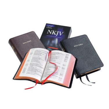
Cambridge Clarion NKJV
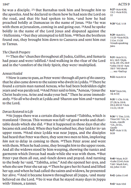
Cambridge Clarion Bibles are ingeniously designed to deliver a rare combination of readability and portability. They achieve this by using a modern digital font that, like the traditional Bible typefaces of the past, is clear and easy to read even when set in a modest type size (just under 9 point). The generous line spacing also contributes to the legibility.
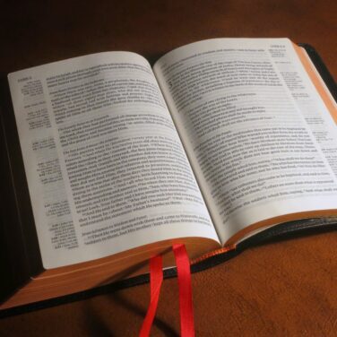
Clarion Bibles have two special features: the Bible text is not divided into columns, but runs right across the page, and the cross-references are in the outer margin of the page. Their other distinction is that they use paragraph format, rather than starting every verse on a new line. Both of these typesetting devices make the text very readable and natural. Here is a pic of the interior.