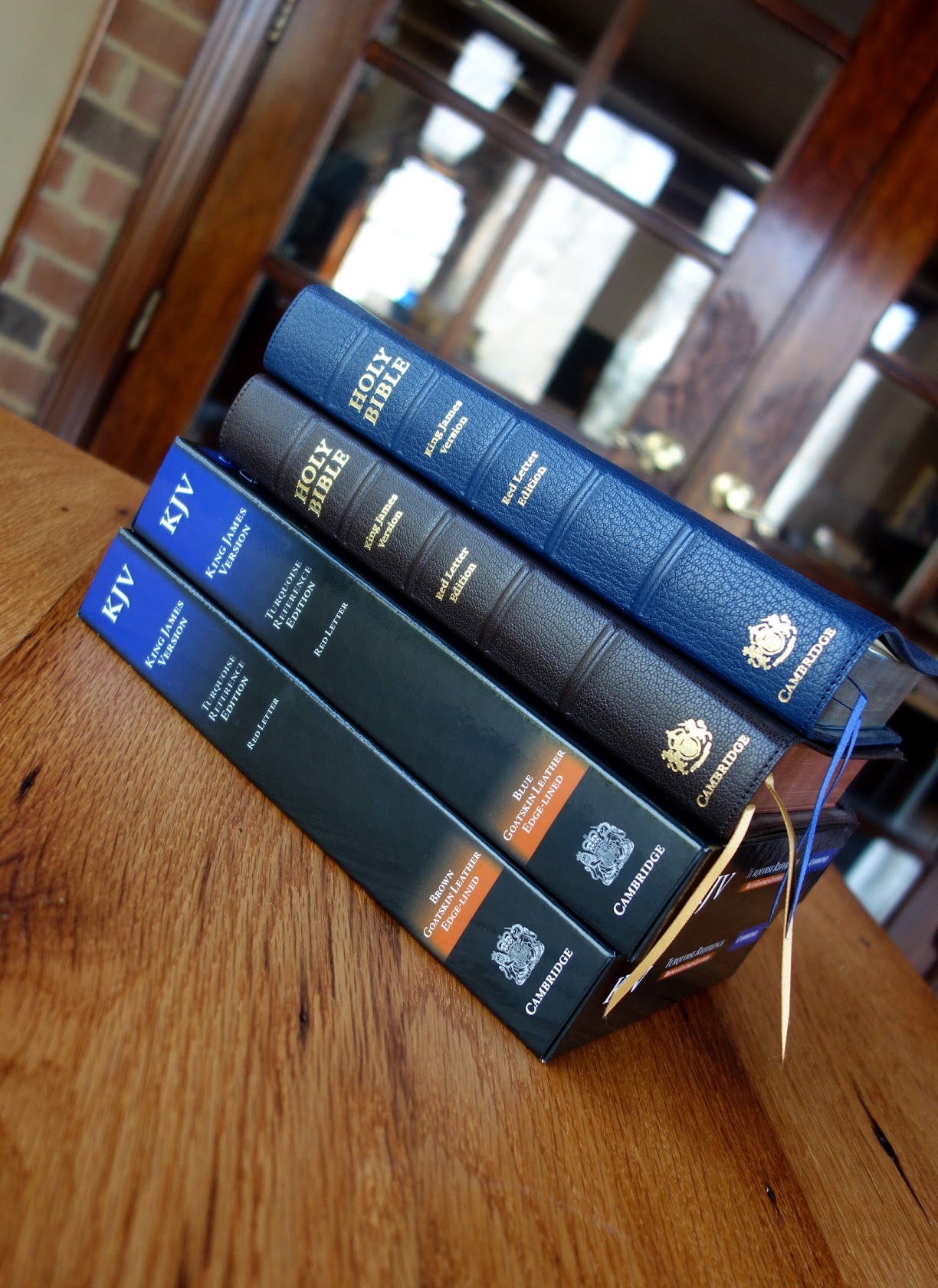
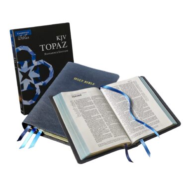
Cambridge Turquoise KJV Reference Bible, Blue Goatskin
Original price was: $355.00.$210.00Current price is: $210.00.
In stock
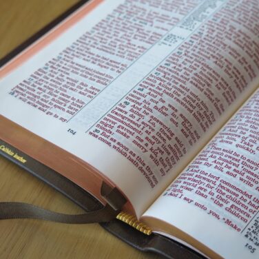
Dark blue goatskin cover with leather lining
2 blue ribbons and blue under gold gilt
Page size: 9.2″ x 6″ x 1.3″
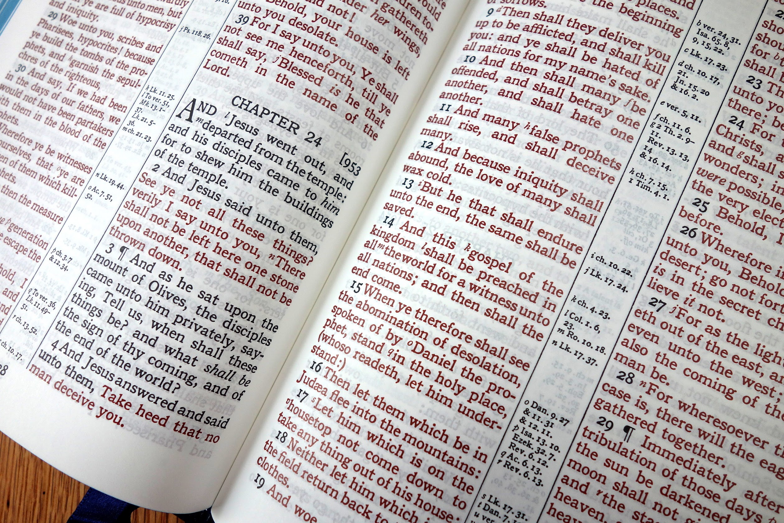
10 pt. font with words of Christ in red
Cross references and Concordance
See Description below for more details.
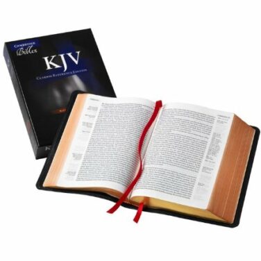
Description
Description
The Turquoise Reference Edition of the King James Bible was created in the 1920s and has stood as a superb and well-loved example of classic Cambridge typographic design for over ninety years. The large format allows the text to be presented in a comfortably readable form using a bold, traditional typeface with cross-references. For this edition, the concordance has been freshly typeset, and the Bible includes the Translators’ Preface, their compelling account of the principles underlying the publication of the KJV in 1611.
Features include:
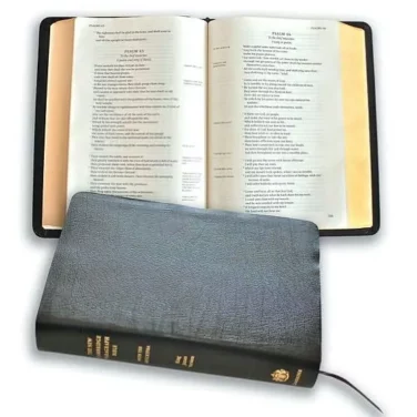
Navy Goatskin with full leather linings
Blue under gold art gilt
Two navy ribbons
Red-letter text
28 gsm Indopaque paper
Translator’s Preface
Pronunciation marks
Italics for inserted words
References and concordance
Family record section and presentation page
Map section
Smyth Sewn
Typography: 10/11 point Antique Old Style No. 3
Page size: 9.2″ x 6″ x 1.3″ (234 mm x 152 mm x 32 mm)
PDF text sample
Reviews
41 reviews for Cambridge Turquoise KJV Reference Bible, Blue Goatskin
You may also like…
Related products
-
TEMPORARILY UNAVAILABLE - NO DUE DATE
New Cambridge Paragraph Bible, Personal Size, Black Calfskin
Original price was: $155.00.$99.00Current price is: $99.00. -
Cambridge KJV Pitt Minion Reference Bible, Black Goatskin
Original price was: $170.00.$115.00Current price is: $115.00. -
Cambridge KJV Clarion Reference Bible, Black Goatskin
Original price was: $290.00.$180.00Current price is: $180.00. -
Cambridge KJV Cameo Reference Bible, Brown Calfskin Leather
Original price was: $175.00.$115.00Current price is: $115.00.
Jonathan Grove (verified owner) –
This is a really nice Bible and it really looks good with the blue leather cover. I love Cambridge bibles.
James H (verified owner) –
Excellent bible… Well packaged by Evangelical Bible. Be advised – the lighting in the stock photos, makes the bible appear more of a cobalt/electric blue. Its actually more Navy-ish Blue. I still can’t stop looking at it… Highly recommended!
Dan Perez (verified owner) –
This is thee only company that has the Turquoise edition in Blue goatskin as far as I can tell, other than Cambridge themselves. I had my eye on this particular edition for 2 weeks after seeing a review on in from a 2yr old youtube video. This Bible will be my lifelong bible for safe keeping, its my home study/personal bible. The leather is so soft and pliable, the blue under gold art-gilding is beautiful! , the pages so easy to flip back and forth with , & the 1920 font at the font size makes for easy reading. I love this Bible love the colors. Cant say enough good things. Highly recommended.
Lee Poskey (verified owner) –
Magnificent!
I only have one eye, and my 58 year old eye is getting worse vision over time, and I felt that I couldn’t read my existing Bible for extended periods comfortably.
So my loving wife bought me this beautiful blue cambridge turquoise Bible, and I’m so thankful to have it! The font is so beautifully bold that it almost vibrates with spectacularly sharp clarity.
And the quality is second to none.
What more could anyone want in a Bible?
Thank you for sharing some of your valuable time with me.
All glory to the risen Lord Jesus Christ, and no glory to us whatsoever!
Mark Warner (verified owner) –
I waited a year before submitting a review because I wanted to see how it held out after a year of use. I love this Bible! The goatskin is soft to the touch, making you want to handle this Bible. The text is dark and large, making it good for reading in private, while in church, while preaching and teaching, whether the lighting is good or bad. The paper is premium paper, you can tell by the first touch of the page. The red letter in the gospels is among the darkest and most consistent that I have ever seen. The paper is thin, with little show through.
Lee –
I just received by blue Goatskin Turquoise yesterday. What a beautiful bible inside and out! It has such a traditional look and feel to it all around. Clear, sharp, easy to read font and complete with all the original translator notes, which for some reason Schuyler doesn’t include. Cambridge really knocked this one out of the ballpark. I have the Cameo and Concord editions as well but this is just a notch above what are already great bibles. What this doesn’t include that the Concord does is the glossary of word meanings that have changed since 1611. They are readily available elsewhere though.
John Mo –
Readability is second to none. The font is bold and generously spaced out in classic typesetting. Although the paper is relatively thin, it is truly a joy to flip due to its smooth texture. This is more of a table-top Bible due to its size. I also own the blue full yapp KJV Concord as I think the KJV looks best in blue for it brings out the colour of regality and grandeur of the Word of God. To me, while the Concord is the best all-round Bible in terms of referencing aids and portability, the Turquoise is the most readable of all textblocks. These two Bibles are my most treasured.
Barbara Thompson –
This is a finely crafted Bible, except for one thing: the paper. The paper is so thin that I ripped a page right out of the box. Now I can’t return it because it is damaged, and I am left with a Bible that I am afraid to use because it is so delicate. I feel ripped off (pun intended).
Steve L Spencer –
The KJV Cambridge Turquoise in Dark Blue is the finest Bible I have ever seen in my 68 short years! I love everything about it:
* The quality and craftsmanship is supreme in every way.
* The font is large and with my poor vision I can read it for hours on end.
* The paper is the smoothest and highest quality I have ever seen. Period!
* Quite simply–this is the best Bible I have ever come across in all my years as a pastor and teacher of God’s word. I plan to buy another one (one that will not be highlighted, marked up or written in. I would give this Bible 10 stars if I could. Cambridge, you have produced a classic! Evangelical Bible, thank you for making this Bible possible to own–and it is worth every single penny!
Charlo Almeda –
The KJV Cambridge Turquoise in Dark Blue is a sight to behold! The dark blue goatskin cover is a beautiful color that is soft and supple. The light blue under the gold art gilt is flawless. There is very little ghosting, even with its thinner paper. And the size of text is the right size, that is comfortable to my eyes. Your eyes will not strain when you read the text. Indeed, I understand why some people call this text the “slayer” to the Allan Longprimer text. It has perimeter stitching, the Translators to the Reader preface, center column references, a concordance, it’s a red letter edition, and of course, it has maps! Overall, this Holy Bible is a heirloom that is well worth to buy and can be passed down to your sons or daughters. You will not be disappointed. I thank and commend Schuyler Bible Publishers and evangelicalbible.com, to team up with Cambridge, to resurrect and republish an old classic!
alorren0818 –
I really love the bold text. This is great for easy visibility and reading. The blue under gold is a really nice blue. Overall good size and weight. Very little ghosting even with the thinner paper.
Kurt –
Thanks for the great customer service. Always helpful. The bible is nice. I think Cambridge needs to be more competitive in the marketplace today. Some advice: three ribbon markers, start every book on a new page, kjv requires a dictionary, keep the dedication pages small (nobody really wants births, deaths, and the rest). Glad you used perimeter stitching and using raised hubs. Bible owners have more choices now and we expect the very best for all the money you’re asking for. Ribbon markers should have no glue sticking around, the text print should be uniform and not washed out in places, and ultimately you need to check ever high priced bible you sell. You’re asking for hundreds of dollars after all and making a profit. Thanks again.
bama250.mm –
This Bible is Amazing! The cover is very flexible and soft. The Bible is the perfect mix between being floppy but at the same time can be held and read with one hand. The text is very bold and the blue under gold art gilt really helps the text stand out. I like that this has a leather liner instead of the cheaper vinyl liners in other Cambridge Bibles. The paper seems a little thin for a Bible of this quality but from what I’ve read it is a higher quality paper then others of the same thickness. Also would have been nice with 3 ribbons instead of 2. Overall this Bible is a joy to read and is a work of art. I believe this Bible is one of the best of both worlds for study or for reading that has ever been made.
Stephen –
A truly beautiful Bible that is so easy to use. The goatskin is exquisite, the typeface bold, clear and perfectly sized. The page is uncluttered – it’s a joy to read.
My one issue is the gilt edging. The inside back cover is lightly powdered with gilt, and I can see flecks on the outside cover too. It also appears to have been applied inconsistently. In places it’s streaked. Not saying this is a reason not to buy, as there’s not a huge amount, but it’s noticeable and disconcerting given the price. My Allan ESV hasn’t done this in the 9 years I’ve had it. I’ve not had this Bible for even a year.
It is beautiful and a keeper, but the gilt flaking is a tad disappointing.
Evan L Spevak –
Although I’ve owned many bibles over the years, I have a preference for the KJV Turquoise as it is set up with the traditional center column references which I’ve grown accustomed to. Add in the Antique Bold No. 3 font and the Red Letter and this is becoming my favorite version. The text is bold and crisp and I haven’t found any errors. I had this one personalized with my name in gold (just as it’s listed in the review). Thanks to Melissa and the staff at evangelicalbible.com!
Jeremiah –
A beautiful bible, in terms of text and general design. However, a severely off centered spine stamping, exposed glue near the ribbon markers and a couple of crinkled pages, make the $205.00 price tag unreasonable. I couldn’t imagine having paid the original price for this.
Mark –
WOW!! This Bible is the best Premium Bible I have ever owned. I have had a few so this statement does not come uneducated. This is by no means a knock on Allan, Schuyler or any of the other Premium Bibles. There all quality. But this is the Cadillac of them all. I bought the Blue and am glad it is not anywhere as bright as in the picture above. It’s a much darker Blue. Very nice color. The type is so so clear and crisp. It’s a 10 font and bold. So it reads more like a 10.5. In all honesty, Cambridge got it right with the spacing of words and line upon line. Lots of room between both so the words are not crammed together. They have room to breath and it’s a joy on my older eyes. With that said it really reads more like a 11.5 font. The red in the words of Christ are the best red I have ever seen. No ghosting. The Bible itself is not to heavy. And the cover although it’s Goat skin is not to limp. Personally I don’t like a Bible that has a cover that’s to limp. It’s like trying to hold water in your hand. This has nice flexibility and can be held in your hand. What a joy!! 6 stars all around. This is an investment, but if your looking for that lifetime Bible this is the one…No matter what color you choose. It’s worth every penny. You won’t be sorry.
Cat –
The Cambridge Turquoise in the blue goatskin is my first premium bible purchase. I like this bible very much, but the black print seems faded in certain books and the red letter is the same way. Make sure you look through each page before it’s too late to return so you don’t end up like me.
Josh Shupe –
Just. Wow. This bible is amazing! I already had the black one, and decided to get the blue one as well, and I’m so glad I did! Nice, large, crisp font. Great text block, and the leather!! Thank you, evangelical bible!!!
xtianolson –
Very disappointed in the uneven quality of the print in this price range. Acts and Romans in particular are washed out and faded while much of the Old Testament is nice and bold. The red letter ink is noticeably uneven as well. Nice binding and cover, but so frustrating to have the varying degrees of print quality throughout. For this price?
Jeanne Regan –
The Cambridge Turquoise in blue goatskin is one stunning bible–and now, it’s mine! I had been searching for a beautifully crafted, premium bible to see me into my later years and, I must tell you, this is THE one. From the aesthetically pleasing cover, a strong yet pliable goatskin in a lovely shade of blue, to the crisp, bold “turquoise-style” type-setting (Antique Old Style No. 3, to be precise)–this bible will see me through. The gold art gilt, revealing blue under gold when the bible is open, is so elegant. It is an absolute joy to read and flip through. An easy-to-read concordance, even with my aging eyes, and the maps (15) and map index section is on sturdy card stock and are pleasantly vivid…nicely done. I have decided that I will not be marking this one up–the Turquoise is strictly a reader for me. I was debating whether to purchase the same bible in brown (a beautiful brown, by the way), but I ultimately chose the blue as I did not own a blue bible. I am also pleased with the smyth-sewn binding and overall quality of Cambridge; therefore, I know this will last for years and years to come. Thank you Evangelicalbible.com for your offerings and excellent customer service.
Elizabeth –
Just perfect in every way. You have to hold it and look at it inside and out to appreciate it. Thank you for your great service Evangelical.
Zachary –
This is my first true premium bible. I won’t rehash all of it’s highlights but will say this: the print is great, it is bold and easy to read from the pulpit. This is my first goatskin cover and it does not disappoint. I highly recommend this bible, old school feel just fits right with KJV bibles.
Tanner –
I have owned many, many Bibles over the past four years. There is not another Bible that I have ever loved more than this one. If you are a KJV fan and you are looking for just “one” Bible to use the rest of your life, I would invest in this Bible. Everything about this Bible makes me want to use it all the time and take it everywhere I go. I couldn’t recommend it enough. Be sure to pick one up before they run out!
Donald Tracey –
I was overjoyed to discover that the Turquoise Reference Bible is a reissue of my beloved 1996 vintage CD286 Presentation Reference Bible. When I found that out, I ordered a Turquoise as soon as I could.
I chose the blue goatskin version. The cover is nicer than my older version (better stamping, more pronounced raised spines) with a slight yap that makes the new bible look a bit bigger than the older one. The helps in the back are a bit different (i.e., no bible dictionary) but the interesting Translators to the Reader is included and the new maps and color coded map index are very attractive.
The print is crisp and clear and the red letter (looks more like a light magenta to me) is easy on the eyes and pretty uniform in shade throughout. On some pages the red is perhaps a bit darker than on others although one really has to look closely to be sure.
The goatskin binding is beautiful, supple, and has a very faint pleasant smell that I hope lasts. I think this five-star Bible is the flagship of the Cambridge line.
wayne rexrode –
This Cambridge navy blue goatskin turquoise Edition is the very best Bible one could have.
This classic design has been a favor for nearly 100 years and still going strong.
The Bold 10/11 font, antique old style is consistent throughout the whole Bible making for a very easy read.
For this Edition they’ve changed the Concordance which may take a little bit of getting used to but I don’t foresee any big problem with that .
And bibles such as this, of course has the translators to the reader, which should be a must in every King James Bible.
Here are some of the wonderful features that makes this Bible even more special:
Navy Goatskin with full leather linings.
Blue under gold art gilt
Two navy ribbons
Red-letter text
28 gsm Indopaque paper
Translator’s Preface
Pronunciation marks
Italics for inserted words
References and concordance
Family record section and presentation page
Map section
Smyth Sewn.
For me if I were to own just one reference Bible this would be it.
So I would have to say I am a very blessed man for owning one.
Maybe in the near future I will purchase a brown one?
Elisa –
I just received my Cambridge Turquoise blue goatskin bible in the mail today! I absolutely LOVE this bible! It is the easiest bible I have ever seen to read ever! Between the opaque paper, the bold font, the line spacing and matching, and the layout of the text this bible is hands down the most readable bible I have ever owned!!! Not to mention the quality of the binding and art gilt is excellent!! Definitely worth the money!! You Will not be disappointed buying this bible!
Judy Morrison –
I am very pleased to own this bible. The very soft cover is in a beautiful dark blue. I like the old fashioned typeset and dark print in a large font. The red letter text is bold and dark. The arrival time was very fast. Thank you evangelicalbible.com.
Edward Farmer –
I know that this is a first run for this resurrected edition, but Cambridge has been making premium bibles for a long, long time and I would expect the highest level of quality and workmanship to be presented. Unfortunately, my copy had several imperfections as a result of poor workmanship or quality control relating to the text block. I will say that the leather lined cover was very well crafted and quite beautiful; no issues with that. Back to the text block: Most noticeable was a large blemish or smear on the blue over gold art gilt treatment of the page edges. There were also 2 areas on the page edge gilding where the signatures appeared to be out of alignment resulting in a very noticeable line that protruded out from the entire perimeter of the page edge gilding. Next, there were 4 or 5 pages with crinkles or creases, and finally the ribbon markers were finished poorly exhibiting jagged and gluey edges. I had to return the bible for a refund and chose not to take a chance on a replacement bible.
J. Crenshaw –
I don’t know where to begin. This is truly an amazing Bible! This is my first purchase of a ‘high end’ Bible and I am not disappointed! First, ‘Evangelical Bible’ gets an A+ for their selection and help. I made a couple of phone calls prior to my purchase and spoke with a friendly, patient person as they answered my questions. Shipping was fast also.
The Bible is way beyond what I anticipated and exceeds any expectations I had. The goatskin is very soft and supple. The layout of the Bible is very nice. It’s a pleasure just to look at! I took the Bible to the Pulpit today for the first time and was amazed at how easy it was to look down at the page and read the text. The font and the layout makes it a true pleasure to use. This Bible is just the right size for me to tuck my ‘Notes and Outline’ in and go. I am very please with the Bible and am sure it will provide years of joy.
Edwin –
This is the third purchase I have recenty made. The previous purchases were the RL Allen 62P of which need a color change, and is now nearly perfect, then the Schuyler Q Brown, a beautiful bible out of the box. And now this Cambridge T blue. Of the three I prefer this one for one reason, this is a red letter addition, and a very nice shade of red. The Cambridge T will be the one I carry. I would recommend all three of these bibles, all are beautful and well crafted. Also, they are all KJV, since I am of KJVO persuassion. You will not be disappointed.
ba2001us –
I received the Cambridge Turquoise, Blue Goatskin bible last week. This is the best looking bible I own. The text is black against white paper. With the words from the Lord Jesus Christ in red. It has the translators’ preface, references, pronunciation marks, concordance, and maps with an index.
John Thompson –
I received my Cambridge Turquoise, Black Goatskin Bible this week. It has exceeded my expectations in every way possible. The quality of the binding, the opacity of the paper, the flexibility of the Bible, the list goes on & on, but the one item I appreciate the most is the type set used& the bold black print against the white paper. This is the most easiest to read Bible I own, period. It is a joy to read, & with its great flexibility it melts in your hands. I believe the leather lining helps the flexibility a great deal. Cambridge has hit a home run with this bible, as well as Evangelical Bible with their great prices & great service
nsmzed –
Once again, Evangelical Bible gets it done. Thanks for helping to get this nice Bible produced in blue! 6 Stars!!!
Nancy Russell –
Received this Bible yesterday and love it. What stands out to me is that you don’t see many blue Bible covers with gold lettering; it’s usually silver lettering. This reminds me of my very first Bible when I got saved in the 1970’s. It is a beautiful Bible all around. Easy to read and so so soft to hold. Love the red letter too. You can tell this is from years ago especially by the presentation page- very different. A really nice Bible.
J. Ray Williams –
The received my Cambridge Turquoise Blue Goatskin bible yesterday. I love the Blue Goatskin cover, the blue under gold art gilt pages, and the supple Goatskin leather that lays flat right out of the box!
In comparing my new edition to my older Black Goatskin Turquoise (Presentation) one, I did notice a few differences. The new one does not have a dictionary like the old one, which I find very helpful. The new edition does not have an art gilt gold line around the inside cover. While the new model has a nicer Goatskin leather grain that is very soft, it does not feel as thick luxurious in my hand, but this my change with use. The new version Bible paper seems better in that it is more opaque then the India paper on the older one. The blue ribbons on the new edition are much nicer than on the old Presentation ones.
The Cambridge Turquoise text is superior to the Allan Oxford Longprimer text block; however, the Allan goatskin covers are the best. I guess the perfect KJV bible would have the Turquoise text block with an Allan Longprimer Goatskin cover.
Thank you Evangelicalbible.com for not only encouraging Cambridge Publisher to bring back a classic, but also one in my favor color blue!
Dwight Blakey –
Beautiful,Awesome Bible! I have quite a few goatskin bibles from Cambridge and so far this is in the top two. I will probably purchase another one that’s what I do with Bibles when I really like them in case they go out of print.
J. Ray Williams –
I received my Blue Cambridge Turquoise bible yesterday. I love the Blue Goatskin, blue under gold art gilt pages and the five raise hubs! The leather is very supple and it lays flat right out of the box.
In comparing this bible with my older Black Turquoise (Presentation) editions, I do notice some differences.
1.) The new version is missing the dictionary, which I find very helpful. 2.) The new version does not have an art gilt line around the inside cover, which provides a nice finished look. 3.) The Goatskin leather on the new version is not as thick and does not feel as luxurious in my hand, but the new one has a nicer grain than the older one ( but this may change after using it ). 4.) The paper on the new version seems more opaque than the India paper on the older one. 5.) The gold stamping on the spine is clearer on the older version.
I do like the Turquoise text better that the Allan Longprimer text, but the Allan Longprimer goatskin covers are superior to the Turquoise. I guess the perfect KJV bible would be a Turquoise text block with an Allan Longprimer cover.
Thank you Evangelicalbible.com for not only encouraging Cambridge Publishers to bring back a classic, but also one in my favorite color blue! Overall, I am very pleased with the Evangelical.com exclusive Blue Cambridge Turquoise Bible.
michellef28134 –
I love this Bible! The goatskin is soft and supple, the text is beautiful and bold, the red letter is perfect, very readable and beautiful Bible.
Bible Lover –
Love this Bible! Print is BOLD and clear, red letter is beautiful. Paper is very opaque, which makes the text really stand out. Easy to read. Binding is great, very plyable leather. Classy looking too. This is a 10 out of 10 Bible for me!!
Robert Millison –
Just received my Turquoise in Blue goat. It is a beautiful Bible, and the goatskin is lovely in the hand. There are a few things that were noticeable upon initial inspection: 1) a couple of “brighter” gold lines running along the top, side, and bottom of pages which really stand out; 2) the blue page edges become quite a bit lighter in color from about half-way through the concordance through the rest of the following pages; & 3) corner work on back corners could be better. Overall, it’s a beautiful Bible, but I think improvements could be made.