Schuyler Canterbury KJV, Dark Purple Goatskin Bible
$230.00
Out of stock
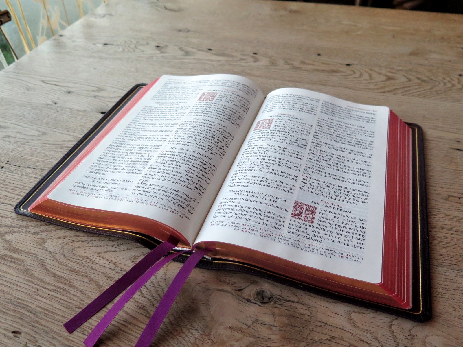
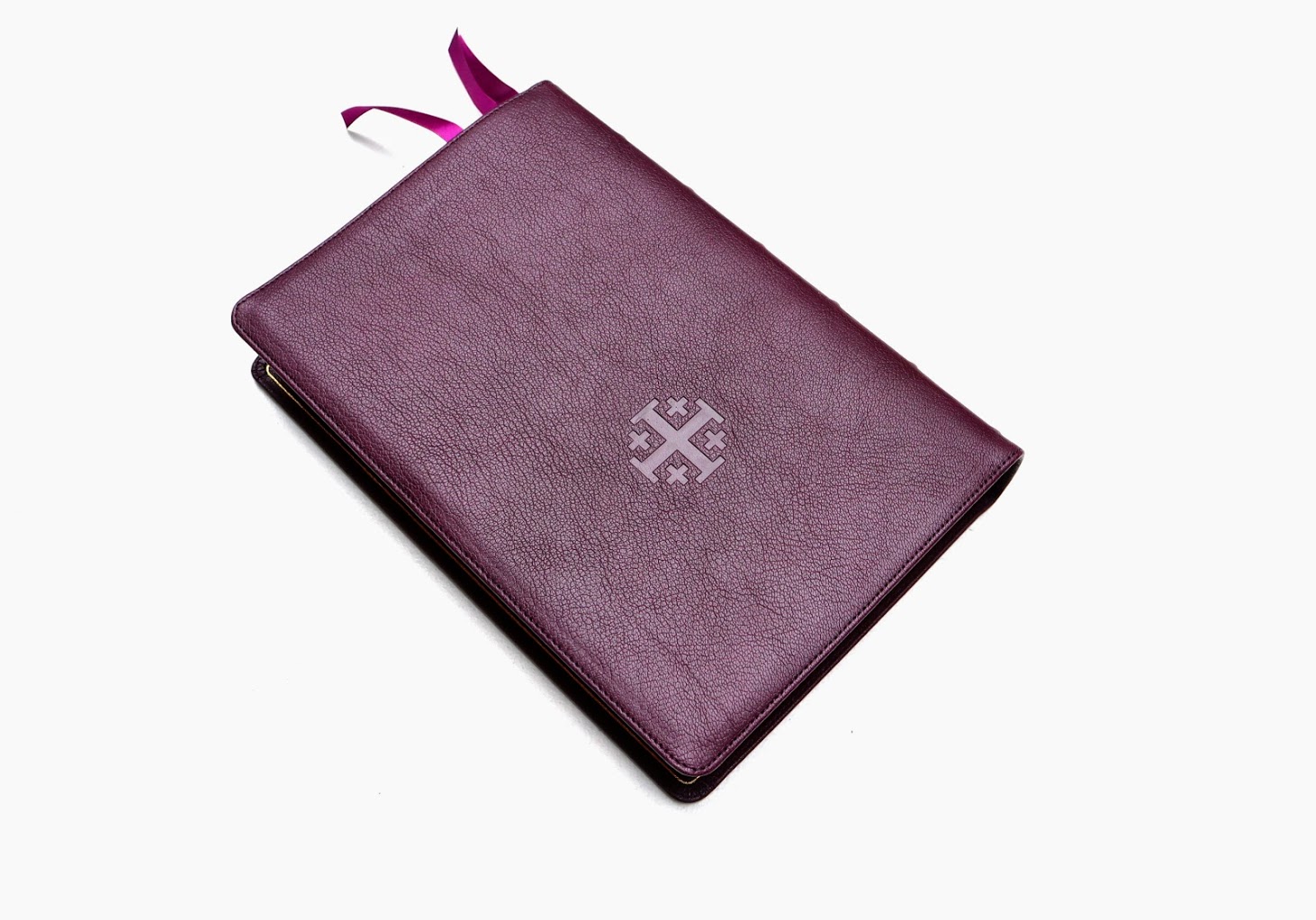
Dark Purple Goatskin cover with Wine Calfskin liner
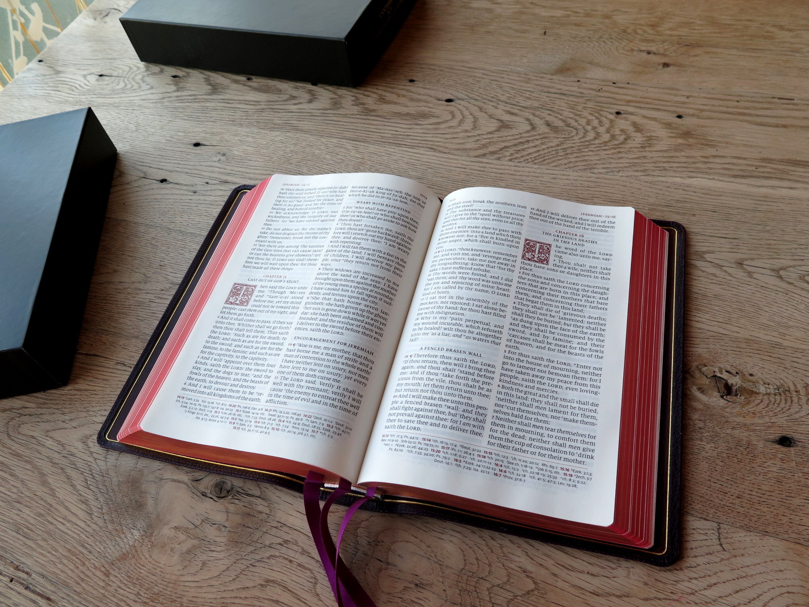
3 purple ribbons and red under gold art gilt
Page size: 6.1″ x 9.1″ x 1.1″
11 pt. font with words of Christ in red
Cross References and Concordance
See Description below for more details.
Receive a notification when this product is available.
Description
Description
The Canterbury Edition Specifications:
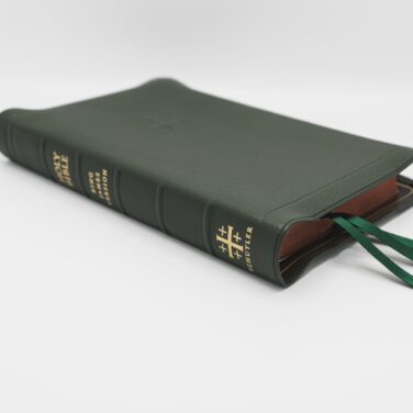
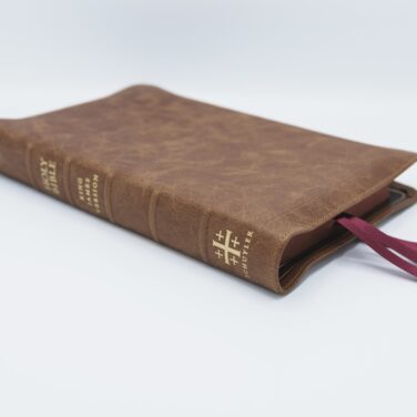
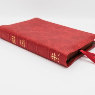
Dark Purple Natural Grain Goatskin, Wine Calfskin Liner
3 Purple Ribbon
Page size: 6.1″ x 9.1″ x 1.1″ (156 x 231 x 29 mm)
Textblock bulk: Approx. 29 mm
28 GSM Paper
PDF Sampler of text.
Font: 11 pt. Milo
Double Column, Verse-by-Verse format
Single Column, Verse-by-Verse format for Psalms
Ornamental Drop Caps
Words of Christ in Red
Italics for supplied words
Presentation and Family Record Pages
Epistle Dedicatory & Translators to the Readers
Line Matching to avoid “see through”
55,000 Cross References
Concordance
Glossary of King James Terms
Art Gilt Edging (red under gold)
Gold Foil Spine Stamping
Lined note paper
Exclusive Schuyler Bible Maps

Martha Phillips –
There are a lot of things working together to make this Bible great: soft opaque paper, beautiful ornate drop caps paired with large readable type and unobtrusive references, a handy dictionary of the King’s English, lined notebook paper- all bound in an unbelievably supple goatskin cover.
But if you’ve reading this review to decide if this is Bible is for you, and you’ve already watched a YouTube review or two, looking for that extra nudge to buy it- I’m happy to oblige.
First off: the hype around Schuyler is real.
What sets them apart from other publishers is their minimalistic layout of the text. The Canterbury facilitates an absolutely unparalleled, immersive reading experience. The little flourishes of crimson in the verse numbers, ornamental drop caps, and words of Christ are beautiful to behold, yet manage (somehow) not to be overly flashy or obtrusive.
Secondly, The goatskin cover has to be personally experienced. I can tell you that it’s flexible, very floppy, and drapes over the lap elegantly. Or that the purple color, depending on the light sometimes looks black, but overall has almost a dark cherry hue. You’ll have to be the judge of that yourself.
Lastly, the fancy French paper is worth every penny. In the hand it’s light and fluffy, but feels silky, almost cloth-like when you run your hand across the page. It is thin, so you have to be kinda careful when you turn the pages, but you get used to it, you’ll be handling those pages like a champ in no time. The red under gold art gilding is incredible.
I’ve had the privilege of owning a few other premiums in the past, but this is the one I reach for first thing with my morning coffee, when I go to church, and when I travel. It’s now *my* Bible. It might become yours too.
Darrin –
Wow, simply just wow, my wife and I love our new Schuyler Canterbury KJV Goatskin Bible’s we just received. We know that these will be our forever bibles, easy to read the print, great paper quality, and even feels great to the touch. We are 110% percent satisfied with the overall quality of our new SWORDS and your teams service.
Jimmy Tanzil –
Thank You Father God for giving me this bible. I know it is Your gift for me.
Thank you Evangelicalbible.com for working with excellent spirit, as you working for the Lord.
I live in Canada, therefore you checked the bible first and make sure its PERFECT before shipping internationally.
I am a bible collector, and I like a PERFECT and professional touch bible, and Father God gave me this bible through evengelicalbible.com .
Please know your excellent service is a blessing for the world!
God bless your ministry!
Johnny H. –
Hi. I purchased the first edition Canterbury and the second printing also. The second printing is an upgrade in one way, and a downgrade in another.
It is an upgrade by eliminating all the pronunciation marks. The first edition was frustrating to read with the overabundance of marks. The second edition was a big upgrade by eliminating all the overdone pronunciation marks.
The BIG downgrade in the second printing is the paper. They went from 36gsm to 28gsm. What a big step backwards. The 28 is MUCH harder to turn the pages. Schuyler could use heavier paper and eliminate the filler in the back of the book. Save the maps and concordances for “study” bibles. I feel they are not needed in the Canterbury. The Canterbury is more of a double column reading bible. 28gsm paper is holding this magnificent bible back!
denis lynch –
Not much if anything to not like about this Bible. Only thing better than the build is the contents. Praise God and thank you Schuyler for this beautiful product.
God bless,
Denis
Airik1111 –
This bibles cover is one of the finest I’ve seen on my Youtube review channel, its clear to me that this leather is hand picked specifically for Schuyler. As I’ve said in my video reviews, Jongbloed is amazing, making different premiums for big publishers has got to be difficult and they do it with style and class. The leather is thick yet plush and the liner gives it the perfect structure so it doesn’t feel slapped on and to floppy. It also cups the book block huging the edge with just enough yap, its Schuyler they have their style and In like that. The Jerusalem Cross stamped cover is very attractive very deep, this just adds to the cool drool factor even more. This is not “purple” IMO its more of a plumb, when I think purple I think Barney the dinosaur LOL…This is a kingly deep purple, the beautiful matching drop cap’s,dark purple ribbons all blends into a gorgeous masterpiece.
A one of a kind King James Bible.
On my channel I recently gave the best KJV crown to the original Allan Longprimer Sovereign but, the Canterbury is a very close second place. No worries Schuyler fans, it’s only because I’m a sucker for that yapp and old fonts. I also prefer center column references but the Canterbury has a very readable reference system which is so easy to use. One major thing that sets this bible apart from the pack is color, each reference and verse header has a nice bold deep red number. The old Allan’s and Cambridge fonts are all black and very small, this I have to admit is a pain, esp for long studies.
Your bible geek eyeballs just might start watering up cause this is about the nicest looking bible on the planet. This font is some of the best reading I’ve seen its big and clear you will say “wow” guaranteed. I gave the Cambridge Turquoise the crown on print but, once again…I’m a sucker for dark black oldschool bold prints. So to end this little written review I gotta say if I was not biased this Canterbury would be my number 1 kJV of all time LOL. Buy this beauty its worth every penny, my only con is that its a bit heavy but that has nothing to do with its absolutely awesome design. Bibles like this come down to personal taste, it might not be my #1 but after reviewing 100’s of bibles I know this could easily be yours.
Seth Street –
Update to my initial review:
This bible has started to grow on me. Instead of seeing it as a flawed study bible I now see it as a reader’s bible with a pseudo-traditional format. It maintains the double column verse by verse format while using a large, crisp typeface and putting the references at the bottom of the page, allowing for wider columns. Though I still prefer the vintage Oxford and Cambridge text blocks, I now acknowledge what the designers were trying to accomplish and they have done a good job. My one piece of advice would be to include the original translator notes without adding numbers into the text, like the Cambridge Concord.
Richard Peter Ricci –
One of the “best” Bibles, if not the best, I now own.
The text is absolutely the best. No ghosting, the easiest to read, Beautiful in hands and “nose” and I’m about to use it for my note taking.
That’s the reason 5 minutes ago I ordered the Personal Size Schulyer Cantebury in the same color. This will be my carry around reading Bible. (I’ve already seen the font on this and it’s still an easy and beautiful read).
My first Bible set I’ve ever owned.
Can’t wait for its arrival. I’ll update everyone on that one also.
God bless us! Everyone…
Anthony –
I bought my wife a purple one and I bought myself a blue one after we received hers. I think it is a wonderful design. I like the very subtle pronunciations and the lack of a concordance, etc. I feel like I can always look at Bible apps on my phone that are going to give me a superior pronunciation as well as more study info. It helps to reduce the clutter and the thickness of this Bible and keep the focus on the reading of it.
It’s the most beautiful reading Bible I have. I have the Allan 53 and 63 Longprimer, but I much prefer the Canterbury for daily reading. It doesn’t seem to have any gaps in the font (I’m always filling in letters and lines in my Longprimer – which I am fine with). I love the Milo font. I would love to have this font set for my own use. It’s just clean and beautiful.
The drop caps are wonderful. The cream tone of the paper is very easy on the eyes. I just look at this Bible as a reading Bible rather than a study Bible. It perfectly fit what I wanted as I have a ton of study Bibles.
I’ve pre-ordered the compact size. I can’t wait to see how that one turns out, although I’m not fond of red-letter Bibles, although this one seems like it will be a dark red.
I just can’t say enough about this Bible. The one con was that due to the hand binding of the Bible (as the folks at Schuyler were able to explain to me) is that my Blue Bible has some leaves that stick up on the Genesis side of things. They did tell me if those ever became loose it would be covered via warranty. So, it’s a great Bible with a great guaranty.
sethstreet (verified owner) –
Pros: It’s beautiful and very easy to read.
Cons: lack of translator notes, won’t lay very flat, not enough cross-references for a bible of this size.
Overall: A beautiful bible that lacks utility. I should have done more research before buying this.
Cheryl Gebhardt (verified owner) –
Just received the dark purple Schuyler KJV Canterbury in goatskin very beautiful Bible and well made if you have a chance to get one don’t hesitate you will be very happy with this Bible
Jordan (verified owner) –
“but if it die, it bringeth forth much fruit” – John 12:24 AV
“Lord! Open the King of England’s eyes.” – William Tyndale 1536
I reverberate the aforementioned endorsements. Approximately 68 years after the conspired death of William Tyndale the commissioning of the King James Bible took place. There has never been and will likely never be a more historical, authoritative, genuine, influential, timeless, exquisite translation than the King James edition of the Holy Scriptures. So it is only fitting that it be treated as such. I can personally say that I have never seen a more priceless treasure than the Schuyler Canterbury KJV Bible. In addition to this great masterpiece, I currently own the Cambridge Concord KJV and the RL Allen Longprimer KJV. While all three editions are extraordinaire in their own right, the Canterbury sets an all new pinnacle that will be beyond many Bible publishers to achieve.
The great men and women of history’s past who sought and labored for the furtherance of the Word of God in our native tongue was not done in vain, and the Canterbury is a proud declaration of that prolonged endeavor!
Rhonda Brown –
I was gifted this bible, amazingly beautiful!!! This is by far the most beautiful bible I have ever seen or held in my hands!! Everything about it is precious!
Mark Chase –
Got my blue Bible about a month ago. Frankly, I’m not seeing it’s worth $220. Should have gone with much less expensive Crossway Bible. I read a lot ov reviews and watched some YouTube videos but my new Bible just isn’t that special.
Paul Young (verified owner) –
This Bible is an absolute joy to read. By far my favorite text block of any Bible I’ve ever used, and that’s a lot! And the purple goatskin is gorgeous. Schuyler hit this one out of the park! My new favorite Bible!
Bill Z (verified owner) –
Like all Schyluer Bibles this is as good as it gets. Beautiful binding, color (purple) and the cover is goatskin. Makes one want to use gloves to handle this Bible. Thanks Schyluer!
Wayne S. (verified owner) –
The Canterbury Bible printed and bound by Jongbloed and K2 is a supreme offering to people who love Old World style. Purple was my color of choice. I love” The Black Face “because of the “self pronouncing text”. My eyes and 8 font no longer work. I was elated to learn this volume had “SPT”. The “Drop Caps”add to the ” Old World ” feel of this KJV. Keep using the off white manilla paper and line matching. The combination is easy on the eyes and defuses glare from Brite overhead lights. The “Kings English ” section is another brilliant part of the Canterbury for archaic word lookup. The only part of the bible that I have issue with is the font in the concordance. I can read the topic words but I will need a magnifying glass for the verses its the font. In all fairness to the publisher my eyes are not youngsters anymore. Overall I am VERY Happy with “The Canterbury “. Thank GOD for HIS Word. Thanks to Paul and all the Crew at Evangelical Bible and Schyluer and all the skilled craftsmen and women at Jongbloed and K2 for the Exalant work they continue to do.
ann (verified owner) –
This purple goatskin KJV Canterbury is simply outstanding. Soft and plush goatskin, lovely dark purple calf split liners, and double spray art gilt make the cover of this Bible beautiful. The ornamental drop caps recaptures an age where this Bible began, as they were used for the printing of the 1611 KJV. Thinner in girth than the Quentel, it makes handling this Bible an easier task and no difficulty at all. The font is the hallmark 11 pt milo font and that is easy on the eyes as well.
Jeffrey (verified owner) –
I purchased the Schuyler Canterbury KJV in dark purple, and I must agree with the publisher, this one is the best they’ve produced thus far I am completely blown away by the gorgeous purple goatskin, even the box is decorated with the name of the bible The goatskin is like holding the finest silk in your hand, and the craftsmanship is second to none. For now, it will live in it’s box in my bible cabinet. It is simply too beautiful to damage by daily usage. I look forward to more outstanding products from Schuyler to follow in the coming years. What gorgeous vessels for the word of Almighty God.
Daniel (verified owner) –
This edition of this KJV bible is absolutely beautiful! The font is very readable to the eyes. But the most important is the meat of this bible, which I mean the word of God. It seems to be based on the pure Cambridge edition text, and it passed all the tests with flying colors. For those of you who are looking for a PCE edition, this will be a blessing. This bible is very majestic. The goat skin is beautiful. This bible will last a life time. God Bless the makers of this edition. ” Praise ye the Lord!!!!!!!!”
Jonathan (verified owner) –
I have two other Schulyer Quentel Bibles (ESV in black goatskin; NASB in firebrick red goatskin), and this one (of course, branded as “Canterbury” instead of “Quentel”) is definitely my favorite because of the superior art gilding. The gold is flawless on all three, but the ESV and NASB are supposed to be “red under gold” but in actuality the “red” is a very light salmon color. Not bad-looking at all, but the Canterbury I received is a MUCH deeper color that actually is worthy of being called “red.” I hope this is an intentional improvement across the board in how they do the gilding and not just me getting lucky.
Of course, the text block is just as wonderful as the ESV and NASB, being basically the same except for the ornamental drop caps on the Canterbury, which are very nice. Very opaque, smooth paper just like the others. No complaints whatsoever. I noticed the reviewer “Christopher” left a negative review over on the black goatskin Canterbury page (his review was negative, but he still rated it 4/5 stars, which should tell you something) mainly complaining about the paper thickness. I’m really not sure what he was expecting, but I can’t imagine this paper being much thicker given the size the Bible already is. I suppose you could argue that they could have removed the lined writing paper in the back and boosted the paper thickness some, but I really don’t feel the paper is too thin at all. As I said, the opacity is very good (ghosting is negligible), and line-matching is spot-on. There is no curling, and the paper surface is smooth as silk.
An added bonus in the Canterbury is a glossary of archaic terms used in the KJV.
I’m very glad I decided to pick one of these up while I could.
Carol (verified owner) –
I purchased this Bible in the purple and it is absolutely beautiful!!! I love that all three book marks are purple. I love the font size also. The goatskin is so soft. After reading all of the other reviews there isn’t much more to add. So glad that I made this purchase. It makes me look forward to reading the Bible daily!!!
Emelie Bogus (verified owner) –
I absolutely love this Bible. The color is perfect and rich. The text is beautiful to look at! The text is readable in almost any light. This was the first KJV Bible that I have ever owned and I am absolutely in love with it! The gilded edges add an elegance to the Bible that few others have. There is no bleed through even in the red lettering. The goatskin is soft and comfortable. I could not be happier with this purchase!
Les Lyons (verified owner) –
I have to thank right off the top Evangelical Bible for all the work they must have had in fulfilling their deadlines for their customers. I know that I was tracking the delivery of this Schuyler Canterbury Bible with much anticipation, and I was not disappointed. I have read the previous reviews and cannot disagree at all with any of the comments that have been made. This is truly a beautiful work of craftsmanship. My thanks again to all who had a hand in this Bible.
Douglas W Murphy (verified owner) –
First off, I want to thank evangelicalbible.com for their 5 star service and lightning fast shipping !!! I have received my SCHUYLER CANTERBURY KJV BIBLE in dark purple this morning and it far exceeded my expectations !!! In my humble opinion, this is one of the finest examples of the KJV I have ever owned or seen !!! I have went through this bible looking for something to pick it apart like all the other bibles I have bought in my lifetime, and I cannot at this time name one thing I would change about it. The craftsmanship is second to none, and it is very well thought out on how they knew the perfect bible ought to be. Of all the Bible’s that I own, I have never had a purple bible before this, and I am very happy that I went with the choice I made. In the early morning when the sun is bright, the Bible has a very rich deep purple color, as the day progresses towards late afternoon, it takes on a purple blackish color, and into the evening when the lights from our lamps hit the Bible then, it looks black under one of our lamps and brown in the other. I just thought I would throw that out there. The pictures that I have seen on the internet does this bible no justice. If any one person would want the finest copy of the KJV, this is it. I hope this helps anyone out there that’s not sure if they should spend the money on it or not, it is well worth it. Remember, yes this is a very fine example of man made craftsmanship, but it’s what is inside is the real treasure here, GOD BLESS you all.
Paul (verified owner) –
Received 2 Canterbury KJV bibles today Dark purple and Imperial blue. Excellent in every respect. I’ve purchased many bibles from EvangelicalBible in the past . These Authorized Editions are beyond expectations . Bravo to all who made these fine editions. add another star to the five!
J. Ray Williams –
I received my Dark Purple Canterbury bible today. It the best executed Schuyler to date. I have the Quentel NASB, ESV, and NLT. What sets this bible apart from any is it’s interior craftsmanship. The love the red Ornamental Drop Caps, red verse numbers, Italics for supplied words, Font: 11 pt. Milo, Self Pronouncing Text, the darker art gilting and Glossary of King James Terms. The cover is best Schuyler yet. It is softer and more supple then the prior versions.
The purple goatskin is dark ( almost looks brown in low light ). I wish it was a richer and more glosser color. While the goatskin cover is much improved , it cannot rival the London bound Allan highland goatskins covers and it still has the stiff hinge issue. My dream bible of course would have this book block and be bound by the Allan London binders. I will enjoy this superb bible for years to come.
Paul Esposito (verified owner) –
There’s not much that I can add to the first review for this purple Canterbury KJV, but let me agree with him that this is the finest Bible I have ever owned, or seen.
I love the verse format, and I love the switch to single column in the Psalms.
Well done, Evangelical Bible!! You have made God proud, with this meticulous attention of yours to His word!
Wayne Rexrode (verified owner) –
SCHYULER’S KJV CANTETBURY EDITION REVIEW
I can’t tell you how excited l am to receive the most beautiful Bible I have ever laid my hands on, and I am not exaggerating one iota.
Just like in God’s holy word.
Jesus said He would not change one jot or tittle.
Well I could tell you that I wouldn’t change this ♚KJV Canterbury Edition Bible, not one jot or tittle.
Because you just don’t mess with perfection.
And this Bible is perfection at its finest.
The color is better than I expected. Looks so much nicer than the pictures, when you’re holding it in your hands.
I am so glad I chose the Dark Purple Goatskin.
The Natural Grain Goatskin leather is soft and supple it melts in your hands.
I like it better then my♚ KJV Cambridge Goatskin Clarion,
and my RL Allan longprimer 53.
Those goatskin Bibles are very nice. And never thought it would be nicer than the ♚KJV.
Cambridge Clarion Goatskin .
I do love that Cambridge cover.
But this ♚Canterbury, is just a bit better for certain.
It was well worth the extra cost to get it in the Goatskin.
I have held both the Calfskin & Goatskin of the ♛Canterbury in my hands now, and believe me when I tell you, if you get the chance to get a goatskin ?
DO IT !!!
But please don’t get me wrong if you have a Calfskin? It is just as beautiful, a matter of fact my very next purchase will be the Green calfskin Canterbury, and the Calfskin will be my everyday Bible because this Purple one is going to go to one of my children years from now, and when I present it to them it’s going to be pristine.
Okay I got off track let’s get back to my review.
Love the gold foil lines on the inside cover, along with the gold foil spine.
It has everything you would want in a quality Bible, having the Edge lined binding, It’s smyth sewn,and has the Red Art Gilt Edging
(red under gold) ,
And the H&T bands fits this Bible so well.
The paper quality is out of this world , a 36 gsm Exactly as you would want the paper to be in a quality Bible.
The text block bulk is around 35 mm.
This quality paper is so Soft, so smooth to the touch. The pages just turn so easily.When I seen that none of the pages were stuck together, when I first opened my new Bible,that told me that this is quality craftsmanship.
The way they line up the text to help in the ghosting…
Is Perfection .
Text is ultra-clear, very easy to read just impeccable.
And again I have to say Perfection at its finest.
The size is roughly 9 1/4 x 6 1/4. For me, it’s my perfect size Bible.
11 pt.font exactly the best font size in my opinion.
The single-column
Is nice for the regular scriptures.
I have a soft spot in my heart for Paragraph style Bibles.
So I love the Verse by verse format in just the Psalms.
The ornamental drop caps gives that antiquarian look, that makes a Bible so pretty.
I think everyone would agree that the drop caps really add An Elegant Beauty to this Bible.
Italics for supplied words.
Self pronouncing text.
Then to top it off.
Which some people would call the study aides sections.
Which in my opinion it’s not too much, yet not too few.
This beautiful Bible contains 55,000 cross references, which are a good size font. They are placed at the bottom of the page.
Concordance.
Glossary of King James terms.
A map index
Schuyler Maps, the maps have a nice Matt shine, a sturdy quality map for certain.
And it has what every ♚King James Bible shouldn’t be without. The epistle dedicatory and Translators to the Reader.
This is by far, the BEST-All round Bible I have ever laid my eyes on .
I own roughly 70 KJV Bibles, in my collection.
From RL Allan, Cambridge, TBS, lcbp,
CBP,etc.
I also own the Schuyler Classic Reference Black Goatskin .
Which I feel to be a fantastic Bible.
But still nothing can compare to the KJV Canterbury Edition.
From here on out,
I can honestly say this is the best Bible I own or have ever laid my hands on, and I also feel that it will be the best I ever own.
I just don’t believe anybody could ever top this.
And I’ll say it one last time. This is by far is the best KJV Bible, or any other kind of Bible for that matter. And in no way I am exaggerating .
The printers of the ♚1611
King James Bible would be proud .
One thing I’d like to say is thank you Evangelical bible.com, and Schuyler. You have made this man so very happy. The best Christmas present I ever received in my 54 years .
Thank you, thank you, and again, THANK YOU.
And, most of all.
With all my heart ,with all my might. Thank you Jesus.
I love you.
Rex
Let The Church Live Loud 1611KJV