Schuyler Personal Size Quentel ESV, Full Yapp Siena Calfskin Bible
$220.00
Out of stock
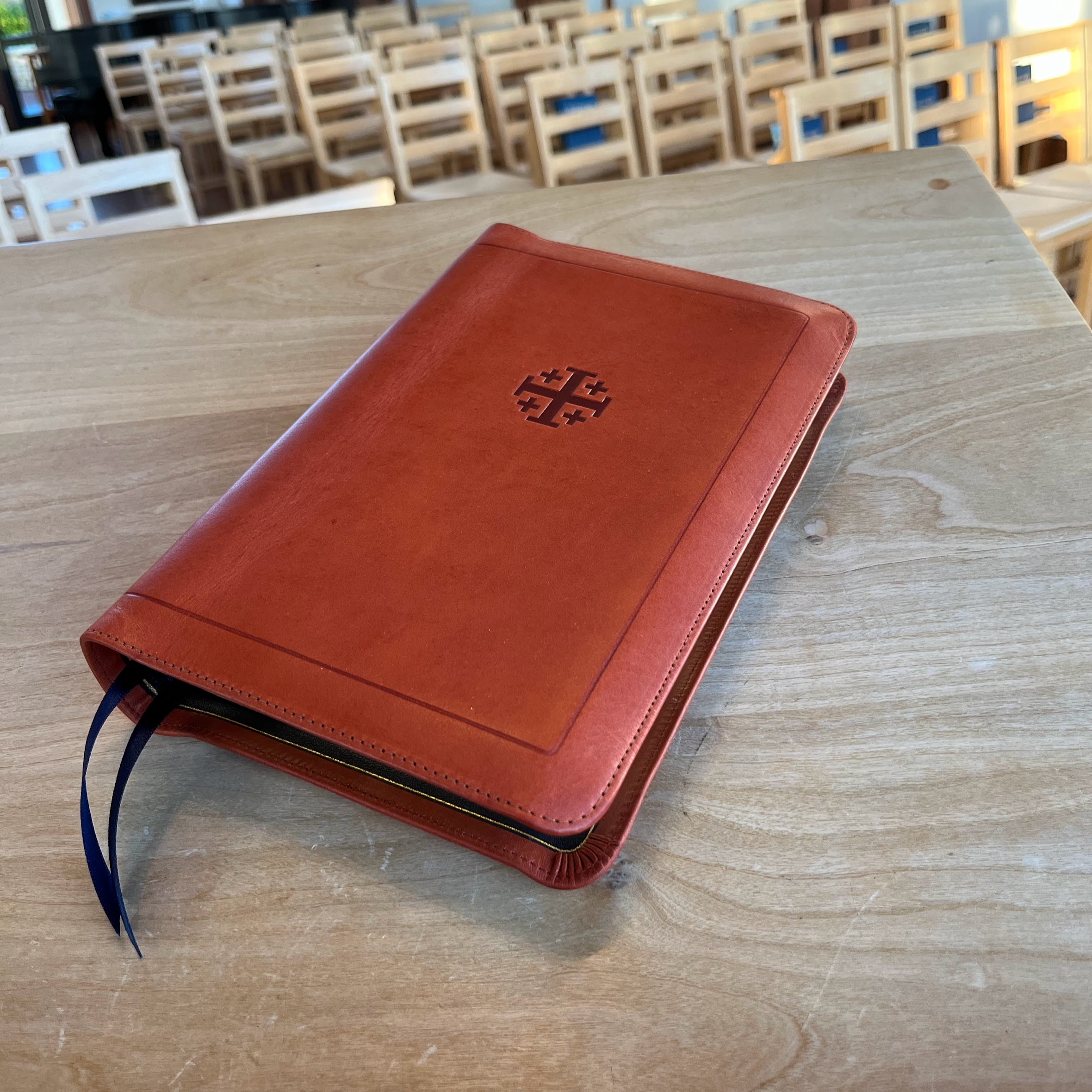
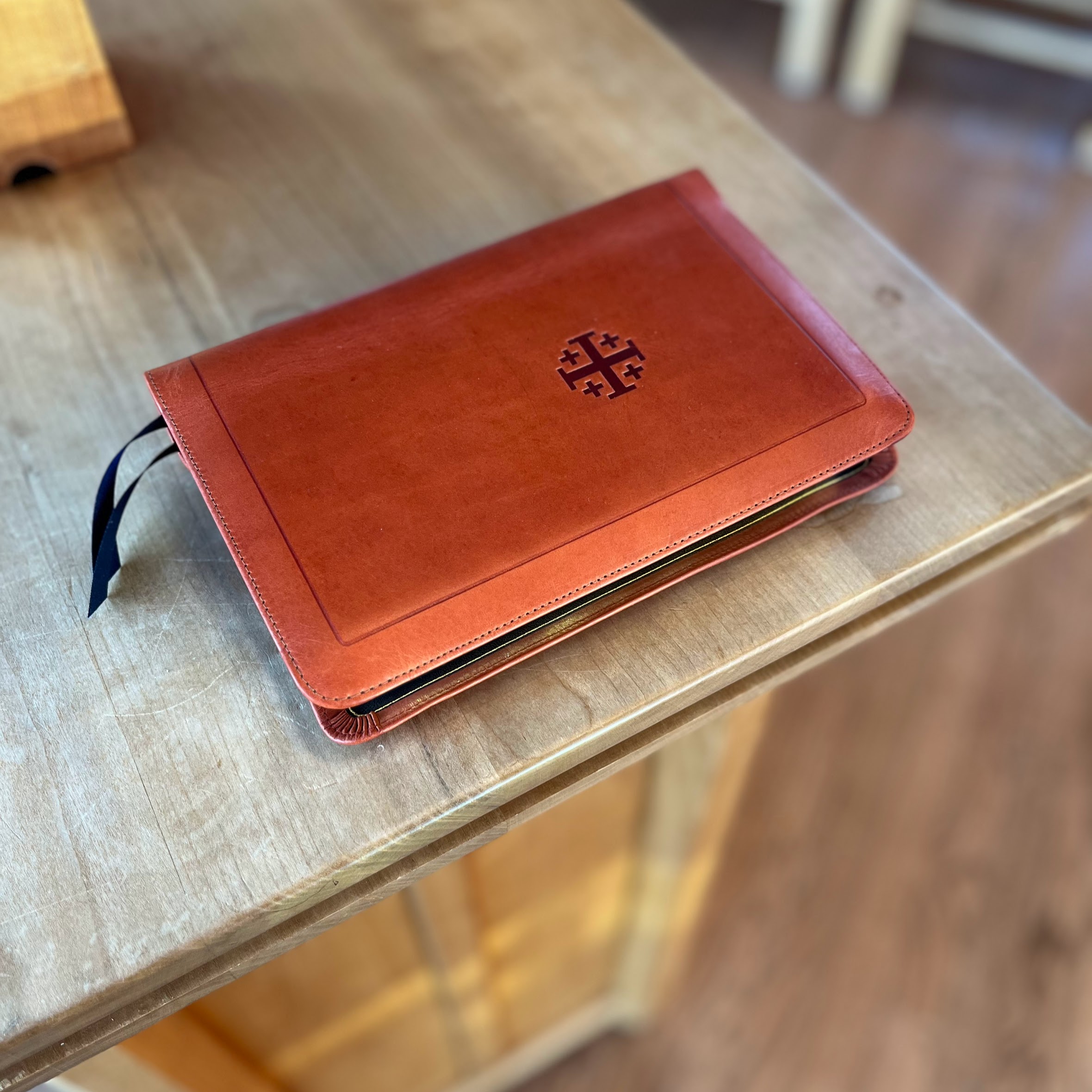
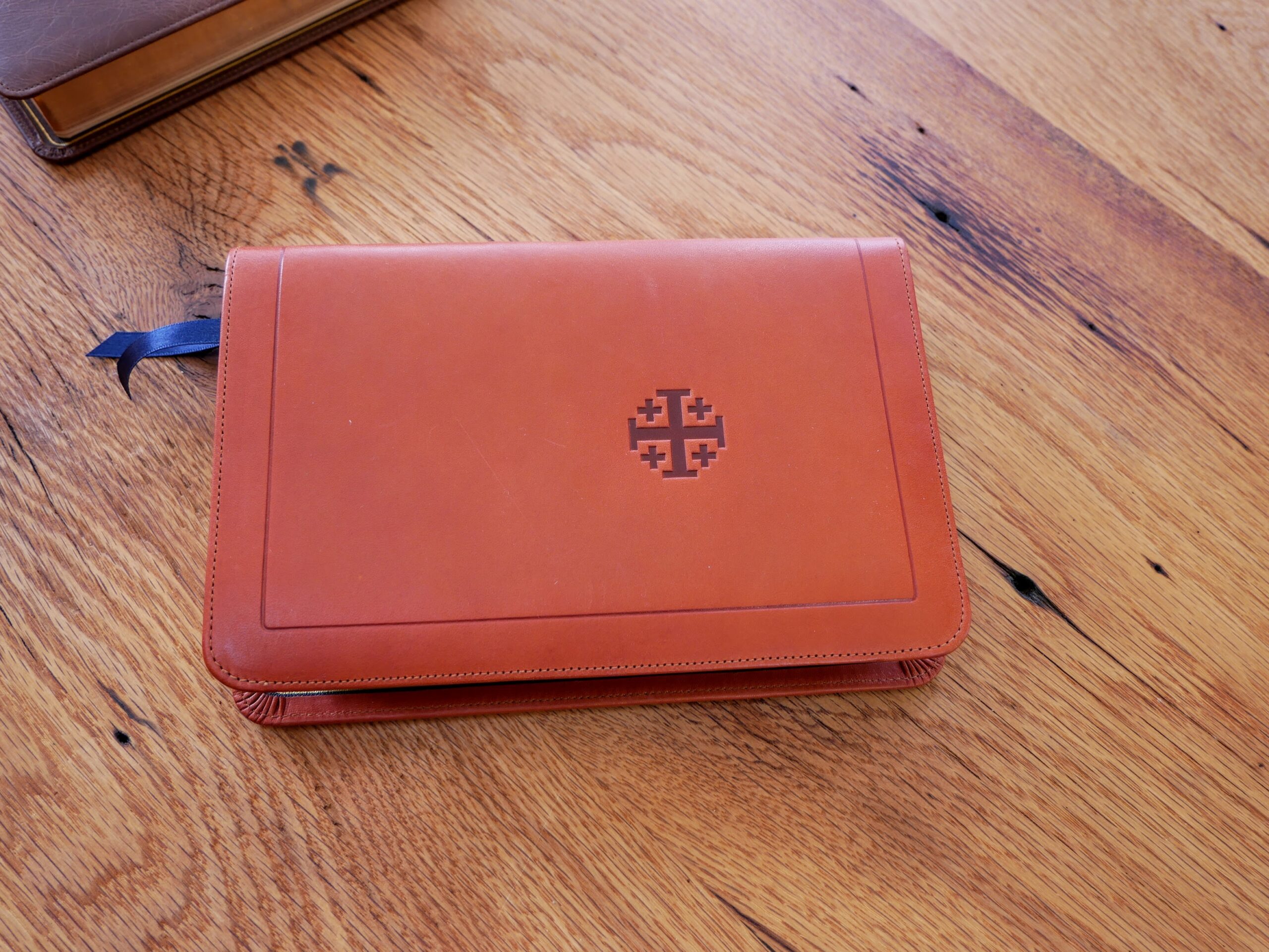
Full Yapp Siena Italian Aniline Calfskin Cover with Navy Blue Calfskin Liner
2 navy ribbons and brown under gold art gilt
Page size: 5.4″ x 8″ x 1″
8.5 pt. font words of Christ in black
Cross references
See Description below for more details.
Receive a notification when this product is available.
- Description
-
Description
The Schuyler Personal Size Quentel ESV is based on the Quentel Series, which is available in the ESV, NKJV, NASB, NIV, CSB, RSV, and NLT. This edition is designed to be a ‘personal size’ companion to the updated regular sized Quentel since it is identical in pagination. See a PDF sample (open at 100% or “actual size”).
Aniline Calfskin reveals the life of the animal in the natural grain, exhibiting pores, healed scars, insect bites, scratches, fat wrinkles, etc. Expect perfect imperfections! This beautiful leather will show marks and stains over time and develop a rich patina with use.
Full Yapp Natural Grain Siena Italian Aniline Calfskin with Navy Blue Calfskin Liner
Same Pagination as the Quentel Series (all page numbers and format will be identical)
Approximate font size: 8.5
Page size: 5.4″ x 8″ x 1″
Line Matching
28 GSM Indopaque paper
2 Ribbon Markers (Navy)
Art-Gilt edging (brown under gold)
Gold gilt line inside the cover
Blind embossing on spine (any name imprinting will also be blind to match the spine)
Smyth Sewn
Black letter text (chapter numbers, headers and page number in red)
More than 80,000 entry cross references
Presentation and family record pages
Lined note paper
Extensive Schuyler Bible Maps - Reviews
-
3 reviews for Schuyler Personal Size Quentel ESV, Full Yapp Siena Calfskin Bible
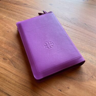
evangelicalbible-9816 (verified owner) –
As always the Schuyler quality is top notch. The paper, binding, font choice, layout of the pages, etc. Perfect. The Siena Calfskin I chose is beautiful.
I love the new layout in the Quentel. I purchased a regular sized Quentel in the spring with the new layout and now this personal sized companion that will be my main travel bible. The ornate dropcaps are gorgeous. I think they started doing this in the ESV translation in the Treveris and am thrilled it made it into their mainstream product.
There has been some controversy in how the cross references are done. In the prior versions of the Quentel each cross reference had a letter next to it that corresponded to a word or phrase in the verse it was for.
On the one hand this made it easy to see both when there was a cross reference to look at, and exactly what phrase/word it applied to.
On the other hand, it made for a lot of noise in the scripture itself. It would be common for a single verse to three, four, or five cross reference letters in them.
I found it to be very distracting. I have an older Quentel Wide Margin and Personal Size, so I know exactly how it was implemented. For the Quentel, my primary purpose with this bible is reading, either on my own, or along with the pastor or teacher in class. I found with the excessive cross reference indicators I would run down my own rabbit hole on a thread. While I would learn something, I’d miss 5-10min of the sermon.
With the new format where the cross references are not intermingled with the text, I can just read the bible free of distraction, other than the very occasional translation notes of the ESV. Then if I have a question about a verse, I can look down at the bottom of the page and see if cross references are available.
If I really want to study, my bible of choice will be a study bible to start with, which has all of the cross references inline with additional notes, and then pulling out the commentaries.
I like the design decision Schuyler went with here. The text is clean, beautifully laid out, while still providing the cross references in an unobtrusive way when I am reading and then want to dig a bit deeper. Well done!
Although they are on the more expensive side, I think I like it so much as soon as the Quentel Wide Margin edition is redone using the new format, I’ll get that replacing my existing QWM with the old layout.
Greg Gifford (verified owner) –
First of all, the PSQ used to be my favorite Bible. It was formerly smaller with no drop caps. However, the new PSQ is now a bit larger, drop caps, and a tad slimmer. Those things are all preferential or style issues, but there is one GLARING problem with the new styles–Schuyler removed the superscript from the text. I didn’t notice until I purchased the new PSQ. This means that the cross-references at the bottom of the page do not match to a word or part of a verse. For me, this is a HUGE issue because it’s not only an everyday reader but a reference Bible. If you get the new PSQ or Schuyler, you should be aware of this change. I love the beauty of these new Bibles but it put aesthetics over study.
Pastor Wayne (verified owner) –
I have always appreciated the PSQ. As a minister, it’s a great on the go edition of Holy Scripture. While the classic edition is wonderful… this newly redesigned edition is amazing. Its size is perfect for an on the go Bible. Schuyler/Evangelical Bible is seconded to none in the premium Bible market here in the USA.
Blessings!
Pastor Wayne
John 10:27