Schuyler Wide Margin Canterbury KJV, Dark Purple Goatskin Bible
$225.00
In stock
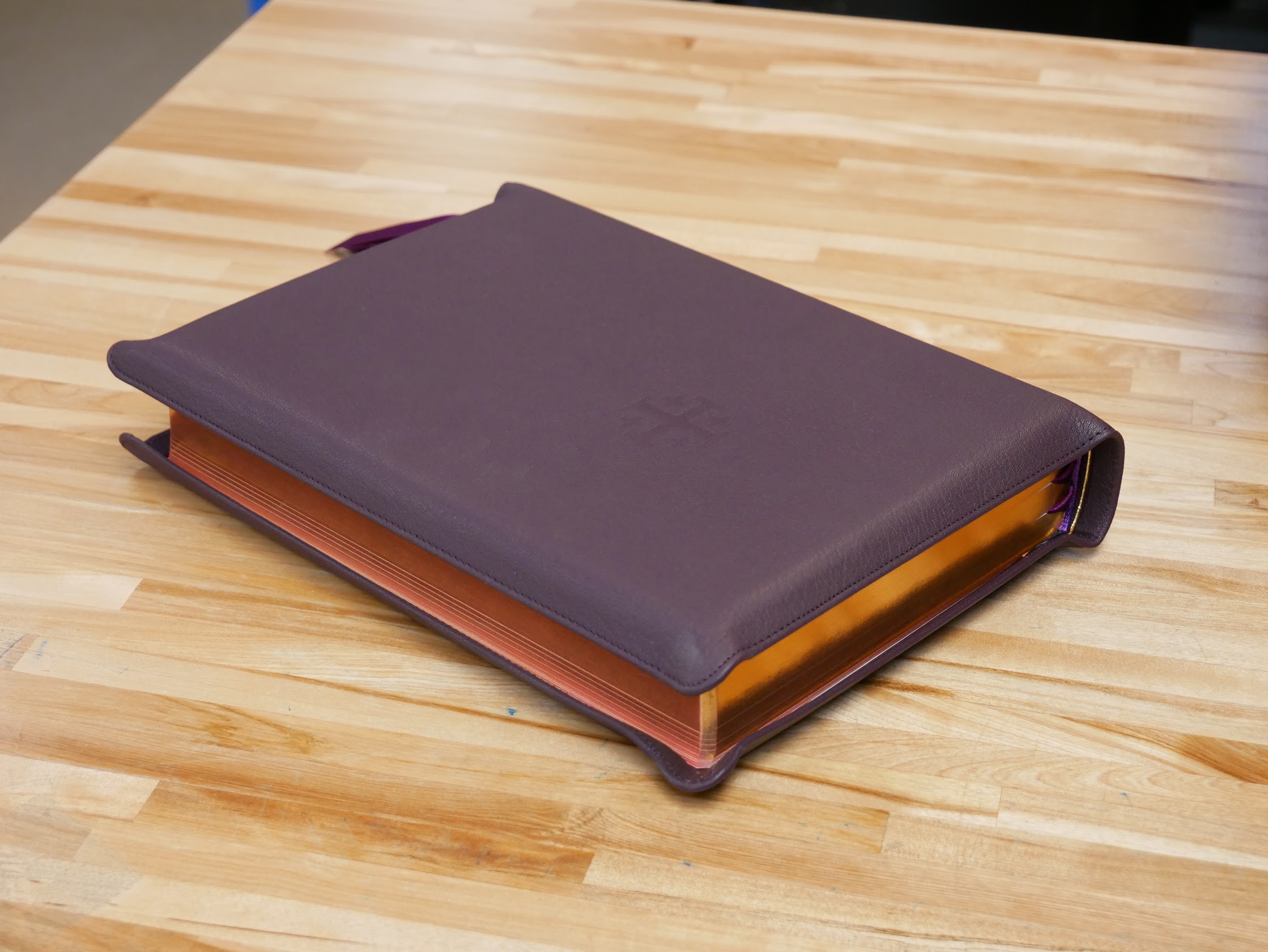
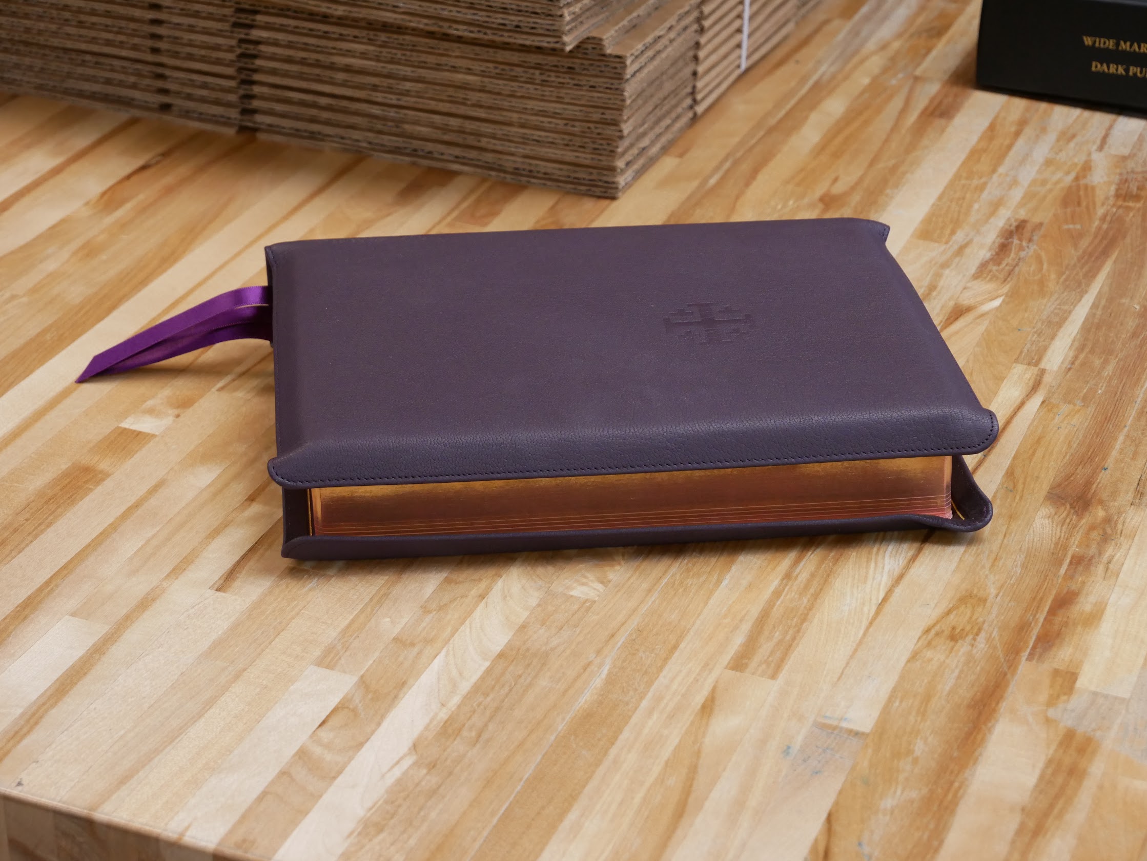
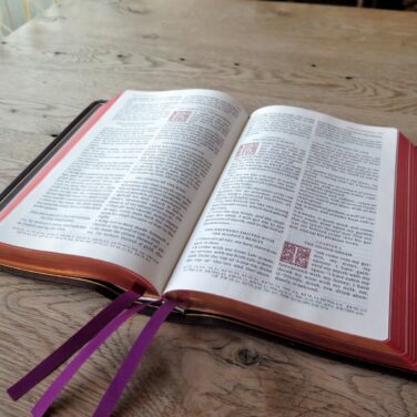
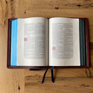
Dark Purple Goatskin cover with Wine Calfskin liner
3 purple ribbons, and red under gold art gilt
Page size: 6.8″ x 9.4″ x ~1.7″
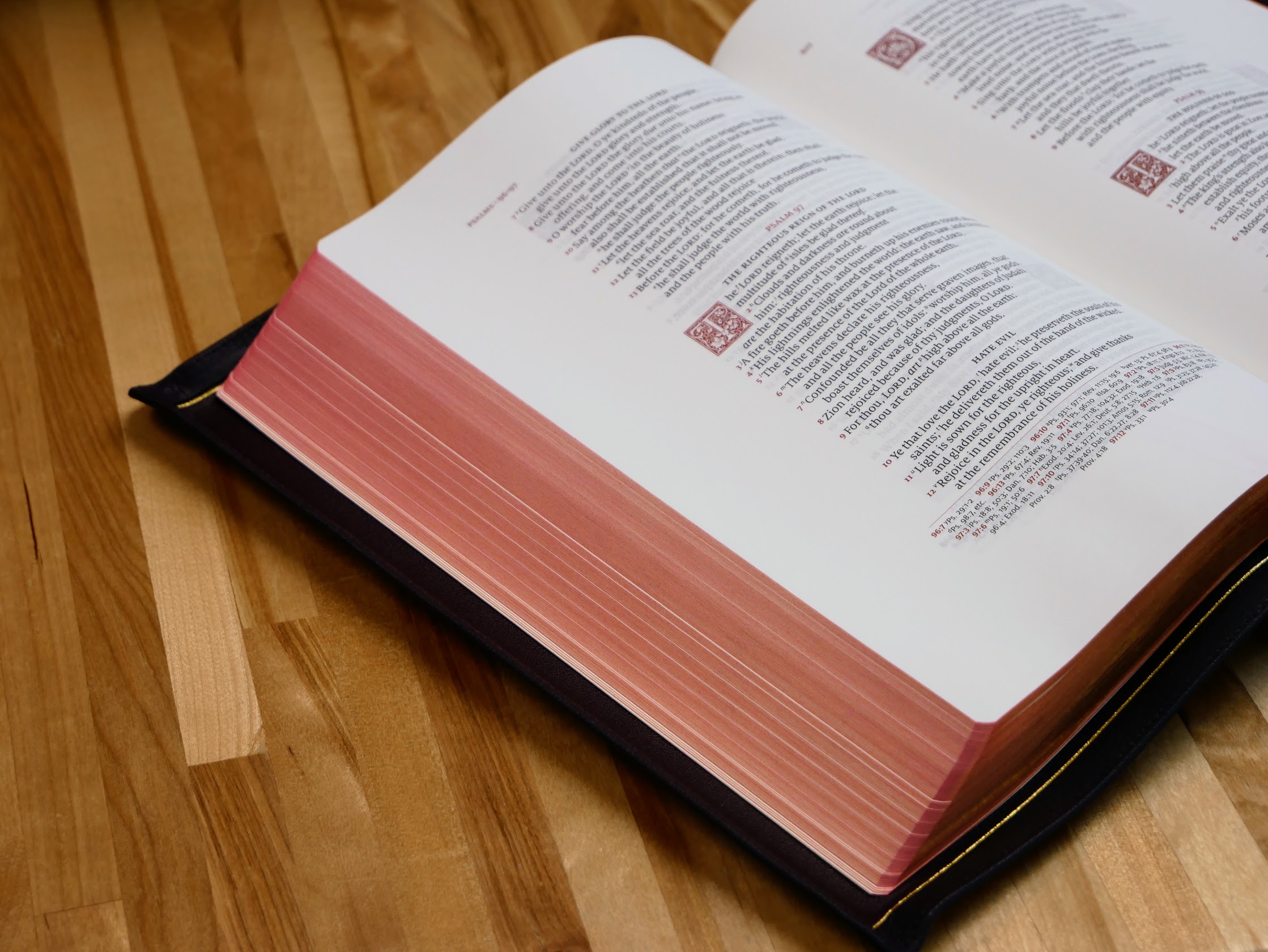
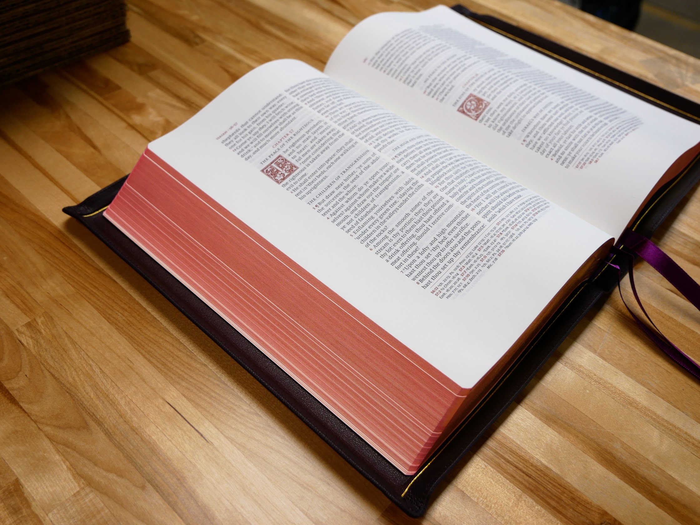
9.5 pt. font with words of Christ in red
Cross references and Concordance
See Description below for more details.
Description
Description
The bestselling Schuyler Canterbury KJV Bible is now available in a Wide Margin format. This Bible will be identical to the current Canterbury KJV Bible, with the following exceptions: 1. Slightly smaller text size: 9.5 instead of 11 point font. 2. Heavier paper – 38 GSM Bible paper. 3. Semi-yapp cover. 4. Last, but not least, wide margins. Outer Margin: 35 mm; Inner Margin 33 mm; Top Margin: 25 mm; Bottom Margin: 31 mm. To see this in a PDF format – click here. Pictures here.
Features
Dark Purple Goatskin with a Wine Calfskin Liner and Dark Purple Ribbons
Trim size: 6.8″ x 9.4″ x ~1.7″ (173 mm x 238 mm x ~43 mm)
Outer Margin: 35 mm; Inner Margin 33 mm; Top: 25 mm; Bottom: 31 mm.
38 GSM Thinopaque Paper (Finland)
Font: 9.5 pt. Milo
Double Column, Verse-by-Verse format
Single Column, Verse-by-Verse format for Psalms
Red Letter
Ornamental Drop Caps
Italics for supplied words
Semi Yapp Goatskin Cover
Epistle Dedicatory & Translators to the Readers
Line Matching
55,000 Cross References, Concordance, Glossary of King James Terms
Lined paper in the back
Art Gilt Edging (red under gold)
Exclusive Schuyler Bible Maps

Tami Russo (verified owner) –
THIS IS THE MOST BEAUTIFUL BIBLE I’ve had. I thought I would never find a replacement for my old OXFORD wide margin, but I believe I have found it! The craftsmanship is phenomenal, the binding is superb, and the beauty of this layout is beyond words! It is truly a work of art; pleasing to the eye, perfect to the touch, flawlessly bound! I was afraid the dark purple might be too gaudy, but it is very tasteful- almost black/brown. The color is distinguishable so that it is unique, yet it doesn’t scream “purple” – it’s very subtle. Every Bible has a little trade off- If I were to change one thing, I would trade the Concordance for a slightly thicker paper. Yet, the paper is thick enough ( not thin by any means), the pages turn very easily, and feels incredibly smooth to the touch. The Cambridge maps are gorgeous! One last thing- I LOVE the typeface. The thickness of ink combined with the font size makes it so much more readable! My eyes have dimmed over the years and my Oxford was becoming harder to read. This one slight change is such an improvement to the readability.
Every time I read my Bible, I am aesthetically delighted! I thought that to transition from my good old Oxford wide margin would involve a grieving process – but I am so pleased that I didn’t allow my skepticism to override my decision to purchase this beautiful Bible!