Schuyler Wide Margin Canterbury KJV, Firebrick Red Goatskin Bible
$225.00
In stock
Firebrick Red Goatskin cover with Navy Calfskin liner
3 navy ribbons, and blue under silver art gilt
Page size: 6.8″ x 9.4″ x ~1.7″
9.5 pt. font with words of Christ in red
Cross references and Concordance
See Description below for more details.
Description
Description
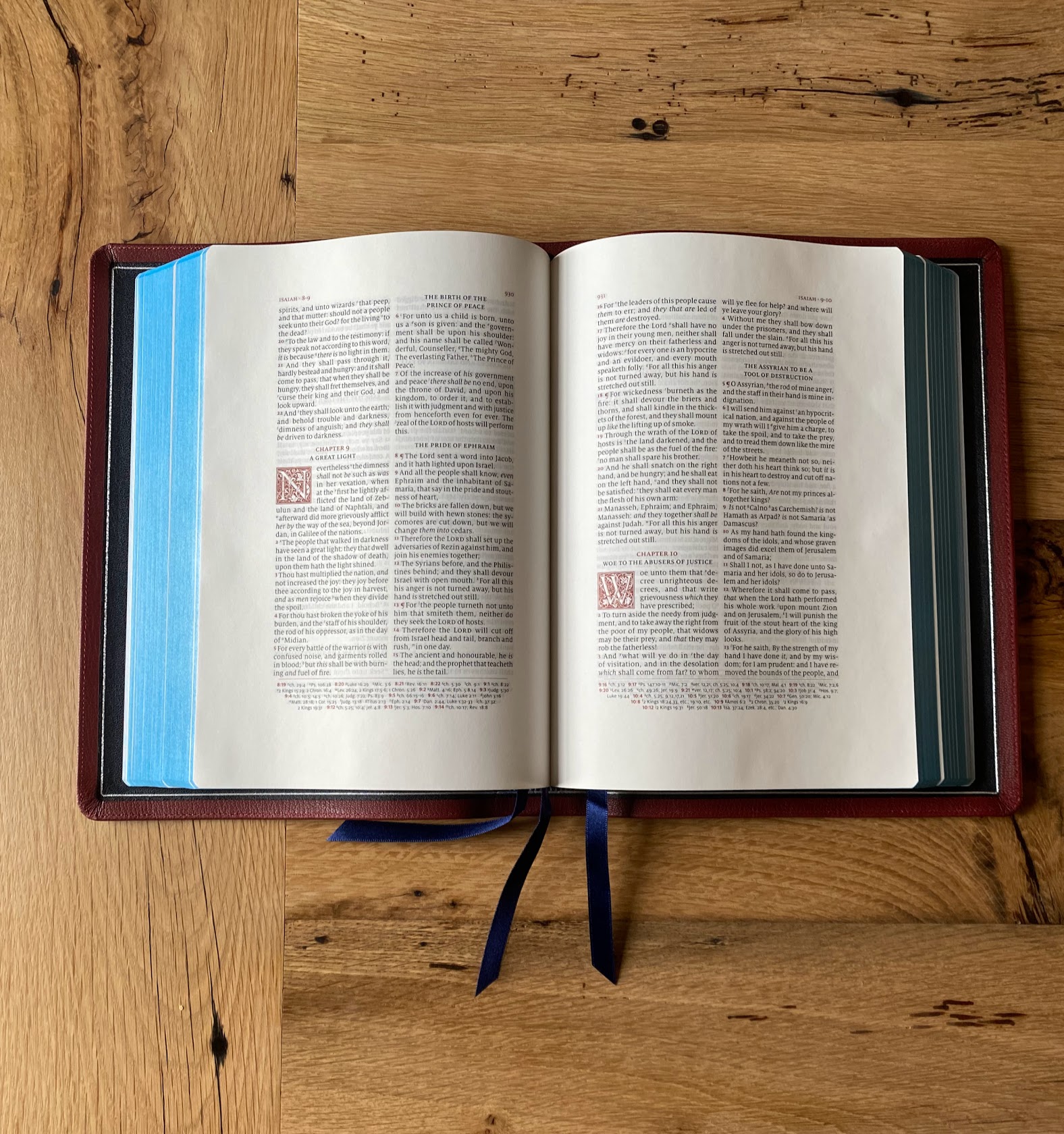
The best selling Schuyler Canterbury KJV Bible is now available in a Wide Margin format. This Bible will be identical to the current Canterbury KJV Bible, with the following exceptions: 1. Slightly smaller text size: 9.5 instead of 11 point font. 2. Heavier paper – 38 GSM Bible paper. 3. Semi-yapp cover. 4. Last, but not least, wide margins. Outer Margin: 35 mm; Inner Margin 33 mm; Top Margin: 25 mm; Bottom Margin: 31 mm. To see this in a PDF format – click here. Pictures here.
Features
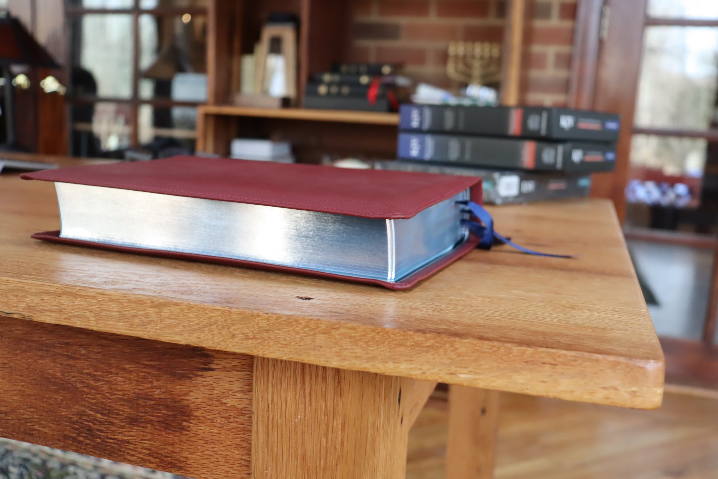
Firebrick Red Natural Grain Goatskin, Navy Blue Calfskin Liner, 3 Navy Ribbon Markers
Trim size: 6.8″ x 9.4″ x ~1.7″ (173 mm x 238 mm x ~43 mm)
Outer Margin: 35 mm; Inner Margin 33 mm; Top: 25 mm; Bottom: 31 mm
38 GSM Thinopaque Paper (Finland)
Font: 9.5 pt. Milo
Double Column, Verse-by-Verse format
Single Column, Verse-by-Verse format for Psalms
Red Letter
Ornamental Drop Caps
Italics for supplied words
Semi Yapp Goatskin Cover
Epistle Dedicatory & Translators to the Readers
Line Matching
55,000 Cross References, Concordance, Glossary of King James Terms
Lined paper in the back
Art Gilt Edging (blue under silver)
Exclusive Schuyler Bible Maps


syost7 –
It is no longer available, evidently, but thank you Schuyler and Evangelical Bible for such a beautifully handcrafted Bible in the KJV Canterbury wide margin marble mahogany. Thank you for the excellent service, and thank you, Jesus, for Your life-changing and eternity-altering Word.
Job 19:25 KJV
For I know that my Redeemer liveth, and that He shall stand at the latter day upon the earth;
Caleb Hoffman (verified owner) –
Absolutely stunning Bible. This is my first super premium Bible and I got to say it is worth every penny. The print is the best I’ve ever seen and the paper is really nice as well. It also has a Kings English little dictionary type thing in the back, which defines words used in the King James Bible, which I found to be super cool. I also love how Psalms is in poetry format.
james.holderx (verified owner) –
Excellent bible! I purchased the RL ALLAN Wide margin and while the paper quality is better IMO, ALLAN’s font size and line spacing is WAAAAY too small. Get this bible, you will not be disappointed!!
redwards –
Jaw-droppingly beautiful!!
In thinking about how I wanted to craft this review, I realized that while I could do so in the form of “Pros”/”Cons”, that would basically result in a long list of “Pros” – most of which have already been pointed out in prior reviews, and a single “Con”, which I’ll elaborate a bit more on in a moment. So instead, I’ve opted to provide a comparative review, highlighting differences I’ve found between this Wide Margin version and the full-size Quentels, and also to help give a qualitative feel by noting a couple of physical differences between this Bible and another well known Bible, the Crossway ESV Study Bible.
I’ll get my “Con” out of the way first: the Concordance. If one takes the time to read through the reviews for the various full-size Quentel editions, he/she will quickly (and frequently) see that MANY full-size Quentel owners don’t like the Concordance in their Bible – not for lack of content, but for size; the print is simply too small. In this Wide Margin version, that problem is on steroids (think last line on an eye chart; you know, the one only Superman can read). No, I’m not exaggerating; it’s TINY! My first thought was “This font looks even smaller than the already small ones in the full-size Quentel.” So I decided to compare to see if my hunch was right, and indeed it was! I opened up my full-size NIV Quentel to the Concordance, and then my new Wide Margin to its, and laid them side-by-side. Sure enough, there is a marked difference; the one in the Wide Margin Canterbury is markedly smaller. Why? Because of the margins. Though small, the Concordance in the full-size Quentels follows the same overall text area footprint as the text portion of those Bibles. But in the Wide Margin, it appears Jongbloed has taken that same Concordance and scaled it down to fit into the Wide Margin format. Why they didn’t at least relax the margins for their already small Concordance to the text area of their other Quentel editions escapes me; who needs wide margins in a Concordance?!?! Better still, relax the margins AND beef up the font size to around a 7.5 or 8.0. Yes, it will result in more pages, but you could actually get some use out of the Concordance (and I’m one that comes down on the side of having a Concordance in my Bible). As it stands now, you’d better either pick up a good magnifying glass, or plan on getting an eye transplant with an eagle if you want to use the Concordance in this edition.
Okay, that’s gotten the negative out of the way. In my view EVERYTHING else about this Bible is simply OUTSTANDING!
A second comparison is physical size. You might be wondering how this fares size-wise with the full size Quentel. They’re about the same in thickness, but in the length and width dimensions, the Wide Margin extends about a half inch further for each, somewhat due to yapp, but also due to design. It’s definitely got some heft to it, but isn’t as “brick-like” as other Bibles, more sprawling. I also compared its thickness to that of the ESV Study Bible (ESB), and the ESB appears to be slightly thicker – maybe ~1/8″. The bigger difference here resides with weight. Even though the Wide Margin is wider and taller than the ESB and the ESB is only slightly thicker, in my hand, the ESB felt noticeably heavier – perhaps on the order of 3/4 to 1 lb more. One last thing to note here is that the extremely supple goatskin of the Wide Margin coupled with its wider width means that you will likely experience a lot of “droop” if/when you hold it open in one hand. This will become readily apparent if – when doing so – your desired text is in the earlier part of the Old Testament or the latter part of the New. You’ll quickly find yourself in an off-balance situation where the Wide Margin’s width and droop will conspire to make one hand holding very difficult.
Third, the color. I have a NKJV Quentel in Firebrick Red goatskin that I purchase a couple of years ago, so I thought I’d compare it with this new Wide Margin to see if there was much/any discernible difference in color. In short, they’re very close to being the same. The Wide Margin appears a little darker because the leather is less glossy (and Evangelical Bible confirms this), and therefore reflects less light. I’m not sure if this is due to a different source/type of goatskin, or some change in how it’s dyed, but the result is a more subdued – but quite beautiful, matte deep crimson red.
Fourth, the paper and layout. The paper has a very slight roughness (“tooth”) to it, making it easier for turning pages, and has a faint off-white cast to it. The font is easily readable and the print quality of mine is consistent throughout. I LOVE the fact that Schuyler got rid of the self-pronouncing text found in the other versions of the Canterbury. It a feature I found to be both redundant and distracting; this version provides for a much smoother need. The red verse numbers, pilcrows, and cross reference links at the bottom of the page, along with the header, chapter identifiers, and ornamental drop caps provide a very pleasant – and useful – contrast to the crisp black text and is in perfect proportion – neither too minimal nor overdone. When paired with the blue of the blue-under-silver art gilt, this makes for beautiful, inviting aesthetic.
Lastly, overall impression. I didn’t start out planning on buying this in the Firebrick Red color; I was focused on the Slate color (which is also VERY beautiful, with its crimson red liner, ribbons, and red-under-silver gilt). But while conducting my research on the Wide Margin Canterbury, I watched a very well done YouTube review that featured the Firebrick Red, and it won me over to the Firebrick Red, and it was a great decision. This color combination is magnificent! Firebrick Red and Silver come together nicely enough, but what pulls it all together are the blue-under-silver art gilt and the dark blue ribbons. Even when closed, you can see a light blue shimmer coursing just under the silver, rendering a somewhat iridescent effect, almost as if the Bible is pulsing with electricity! The blue ribbons enhance things even further by providing a compelling/complementing contrast with the red and silver. Then when the Bible is opened up, the fullness of the sky blue portion of the art gilt shines through, and everything comes together just perfectly! This just might be my favorite color combination of all my Bibles!
Final words. For Schuyler, many thanks and much appreciation for an overall JOB WELL DONE!!! You’ve not just hit it out of the park, you’ve done so with a Grand Slam! Just fix the Concordance issues . . . please! For prospective buyers, if you’re in the market for a premium Wide Margin Bible, your search has ended; your decision now boils down to color choice. But if you find yourself being drawn to the Firebrick Red goatskin, you shouldn’t procrastinate; I understand stock in this color is starting to get low.
Christopher Johns –
Absolutely Stunning!! The Red is gorgeous and the pages are amazing. I wouldn’t say that this bible is too big. It can easily be brought with you. I cannot wait to write in it. I also cannot wait for the NASB wide margin to come out. Worth every penny. Buy it. You won’t be disappointed.
Steve Spencer –
BOY, ARE YOU IN FOR A TREAT!
I received this Bible Jan. 27, 2020 but I wanted to wait a few weeks to do my review because I wanted to have the excitement of the “new” a bit behind me so that I could write a more objective review. So, here goes:
BY FAR THIS IS THE MOST BEAUTIFUL, WELL-CRAFTED BIBLE I HAVE EVER OWNED! AND I HAVE OWNED MANY PREMIER BIBLES (from Schuyler, R. L. Allan, and Cambridge)–but this one beats them all and by a huge margin!. The Fire-brick red goatskin is so, SO very elegant. It has a nice yap (not an full yap. But enough to cover and protect the pages. BUT THE MAIN THING I WANT TO SHARE IS THIS!
When you open this Bible and lay it flat, the fire-brick red and with the silver/blue gilding is . . . how can I put it–OPENING THIS BIBLE WITH THE RED GOATSKIN AND BLUE UNDER-SILVER GILTING IS SO . . . how to I put it. Well, opening it for the first time was an such an aesthetic experience that I just beheld for quite some time. And now that I have had it a number of weeks now, it is STILL an aesthetic experience every time I open it. The drop-caps look fantastic. The paper not only feels great but I have already put my notes in the wide-margins and by using the black and red Micron Pigma .005 just does the trick. There is some shadowing but not distractingly so. And absolutely NO BLEED-THROUGH. And having had many wide-margin Bibles I have now discovered that the black pens for writing my notes and the red pens for underlining is the perfect match. Also, after I have allowed the notes to fully dry–(I usually give it a day or two) but if you use a yellow zebra-ZEBRITE highlighter over your writing it makes the black ink to almost ‘jump-out’ at you. Hard to put into words but it just looks totally awesome! And one thing I can tell you for certain–HAVING THIS BIBLE IS JUST A WONDERFUL-BEAUTIFUL EXPERIENCE! After searching SO LONG for “THE” Bible, well, I finally found it.
I want to thank Schuyler for making this beautiful masterpiece and I want to thank Evangelical bible for supplying such fine Bibles–especially the goatskin. Yes, it costs more, but it will last a life-time (an heirloom bible that I plan to pass on to my loved-ones. O, also the red-letter print looks just so great. Not harsh at all, but looks just very elegant and goes so well with the cover of this bible. I TRULY BELIEVE THAT MY SEARCH FOR THE “ONE” IS OVER. I hope this review is sufficient enough to make you want to own this as your very own. Grace to you and Peace.
therobinfliesagain –
I have just received this amazing Bible in the mail, and was absolutely blessed to own such a beautifully bound Bible. The goatskin leather is a beautiful Firebrick Red, that was actually more of a blood red. The gilt on the page edges was so beautiful especially with the blue under silver. And the type setting is something I cannot get over, I am especially partial to old type settings, but the drop caps and the brilliant red letter are super amazing, and have won me over to some of the modern type settings. I also love the fact that this version of the Canterbury is without the self-pronouncing text, which I personally find to be a bit distracting. Thank God for this great piece of the ” Word of God” .
Tim –
A beautiful copy of HIS Word! First, the print throughout the Bible is clear, bold and consistent! The red letter is perfect! Second, having no self punctuation marks is great! (Really hope that even the future Canterbury Regular and Personal Size editions would follow that format!) Obviously being verse by verse is a huge plus! First day, out of the box, began to utilize what this Bible was meant for, writing and journaling my thoughts and study notes. Like the other comments have stated, the structure, layout, quality is absolutely impeccable! The red goatskin is very nice, great color! Someone else had mentioned the perimeter stitching around the outside cover of the Bible being so well done- I agree, almost unnoticeable, it has been done with absolute perfection. Really like the yapp as well, actually more yapp would be welcomed! Of course the continued service of evangelicalbible is wonderful and really brings the whole experience to another level. Appreciate the care, courtesy and the professionalism of this great company and the beautiful editions of GOD’s Word that they bring to the table! Blessings!!!