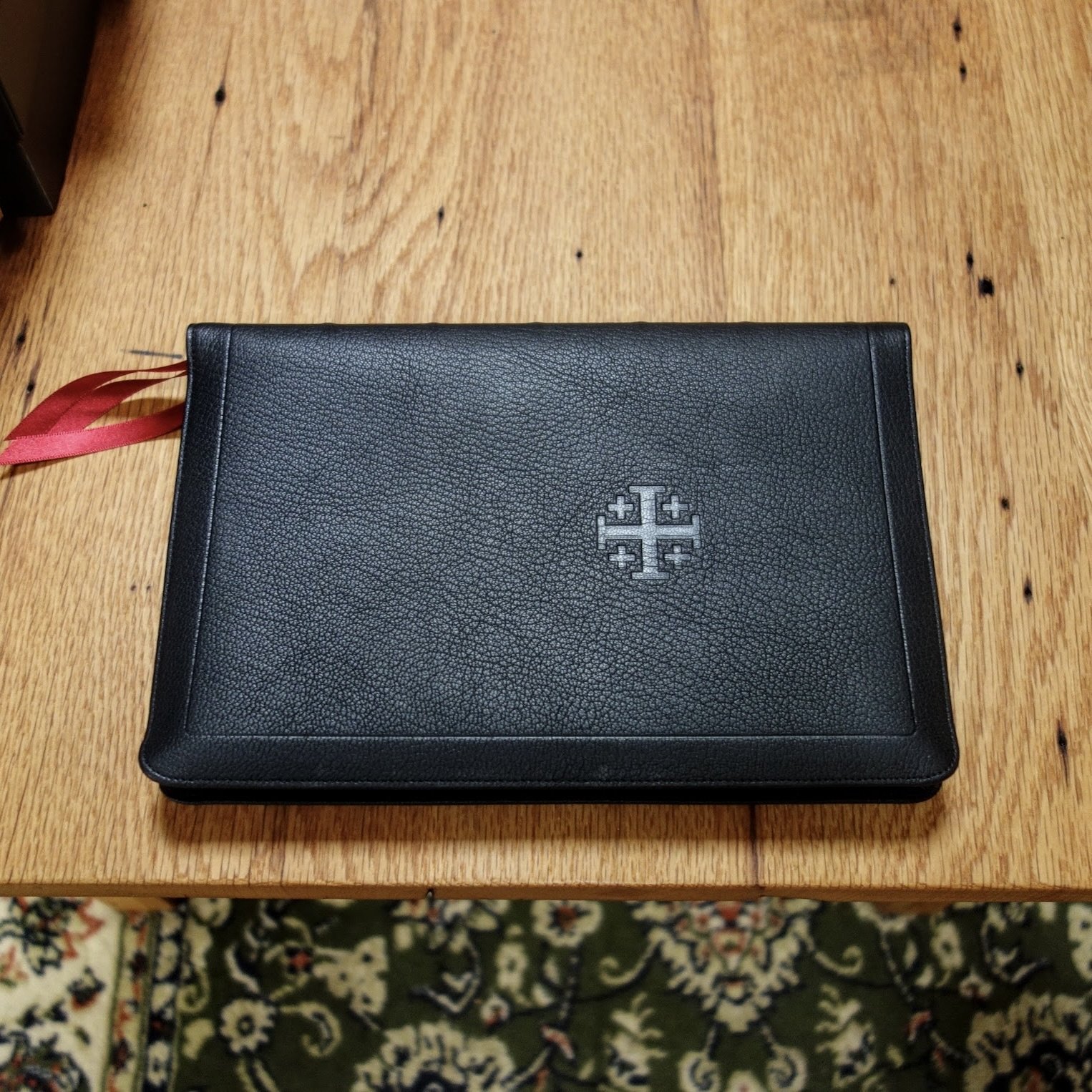
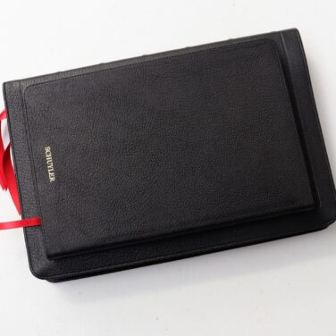
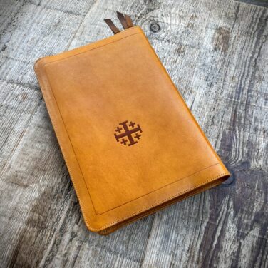
Schuyler Canterbury KJV, Full Yapp Black Goatskin Bible
$235.00
In stock
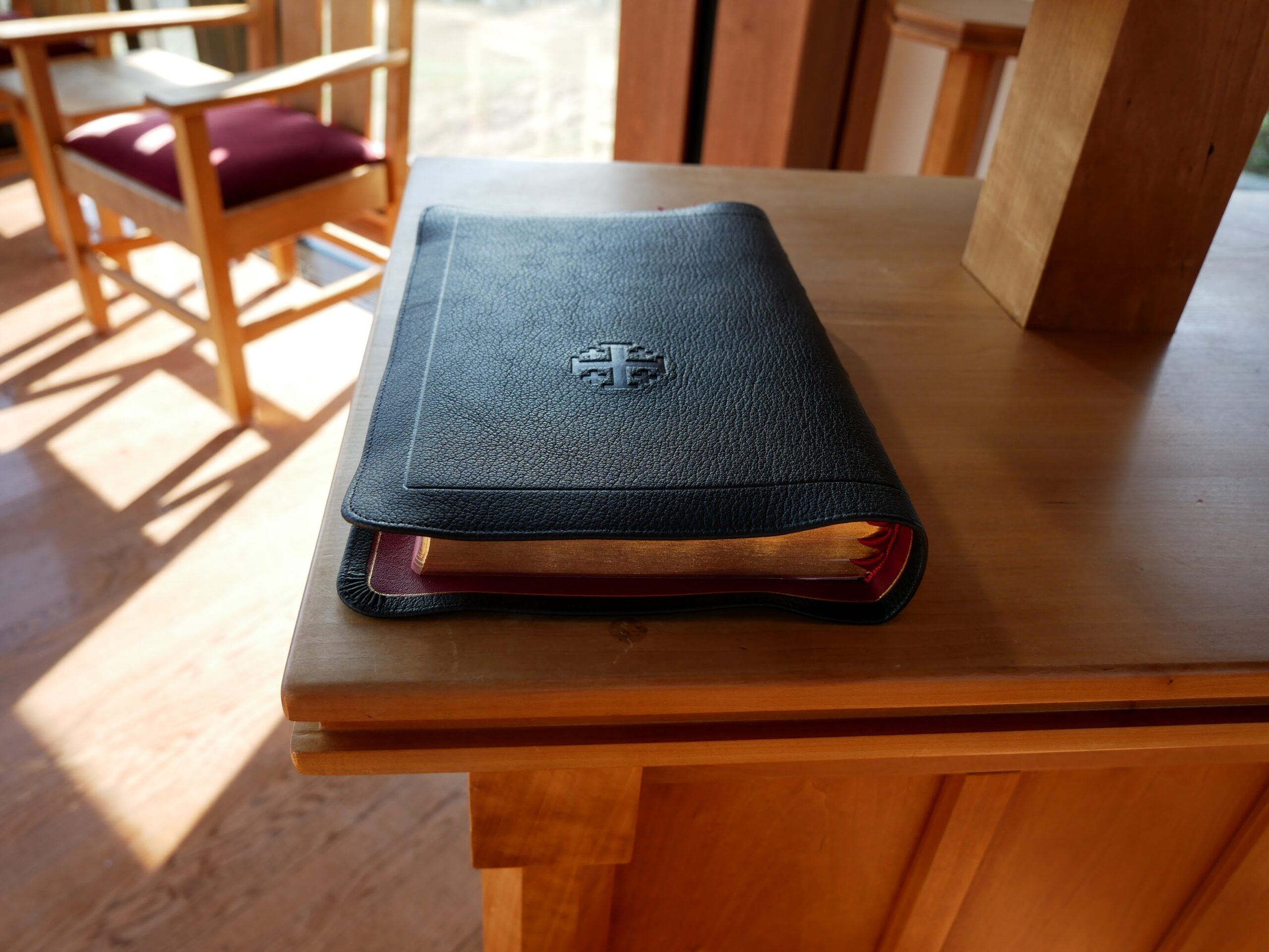
Full Yapp Black Goatskin cover with Red Calfskin liner
3 red ribbons and red under gold art gilt
Page size: 6.1″ x 9.1″ x 1.1″
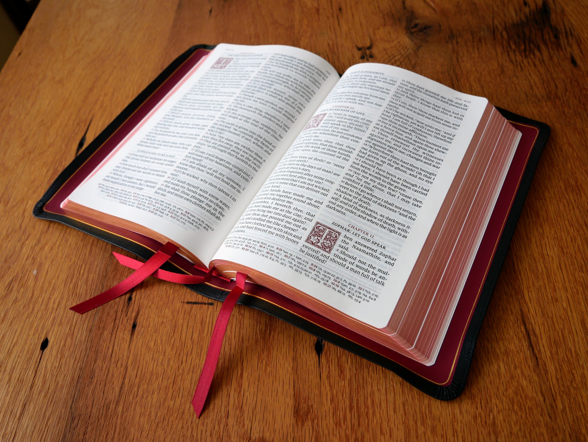
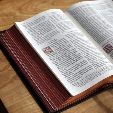
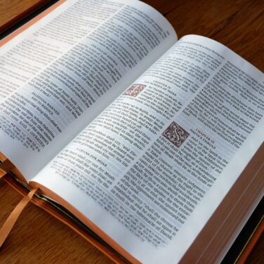
11 pt. font with words of Christ in red
Cross references and Concordance
See Description below for more details.
Description
Description
The Canterbury Edition Specifications:
Full Yapp Black Natural Grain Goatskin, Red Calfskin Liner
3 red ribbons
Page size: Page size: 6.1″ x 9.1″ x 1.1″
Textblock bulk: Approx. 29 mm
PDF Sampler of text.
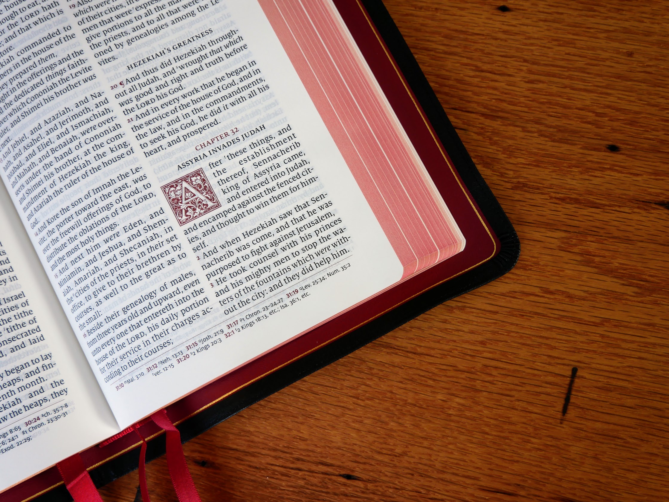
28 GSM Paper
Font: 11 pt. Milo
Double Column, Verse-by-Verse format
Single Column, Verse-by-Verse format for Psalms
Ornamental Drop Caps
Words of Christ in Red
Italics for supplied words
Presentation and Family Record Pages
Epistle Dedicatory & Translators to the Readers
Line Matching to avoid “see through”
55,000 Cross References
Concordance
Glossary of King James Terms
Art Gilt Edging (red under gold)
Gold Foil Spine Stamping
Exclusive Schuyler Bible Maps
Rick –
Simply wow! 6 stars out of 5. I have the personal size Canterbury and love it. That triggered me to purchase this one for the times I wanted a larger bible and larger font. So, I preordered it and according to the website the estimated delivery was sometime in April. Well, it showed up on my front porch today – March 2.
This bible is basically the personal size Canterbury only larger (and with a Concordance). The font is a bit larger than I anticipated so it will age right along with me. The full yapp is actually a bit more than full which is great for a bible this size. It’s a bit thinner than I anticipated so that’s another positive.
It compares closely in size and feel to my RL Allan Longprimer 53. And, just as with my personal size Canterbury (I left a review on that) I didn’t think another bible would unseat my RL Allan’s – especially the Longprimer. Well, this one does – for all the same reasons I stated in that review. So, the Longprimer goes on the shelf and the Canterbury takes its place on the desk. Job well done Schuyler – and of course Evangelical Bible.
Christopher Demorest –
Bought two. One for myself and one for a friend. The yapp is full. Meaning you can touch the book’s cover together. The top and bottom yapp could use an extra centimeter but does not keep them from touching. The goat skin leather, binding, and paper are incredible. The text “pops” out of the page. Fantastic!
Jay Brunot –
Greetings, I recently received the newest version of the Schuyler Canterbury. Everything about this Sacred Writ can only be described as “high end.” It’s elegance is unmatched. From the pliancy of the goatskin cover, with the full yapp, to the silk-like texture of 28 GSM paper, it is truly remarkable. Line matching for opacities sake, extensive cross references, and concordance, along with an AV glossary, make it most desirable. While all of it’s features are marked with high regard, indeed, it is the content of God’s Holy Word that renders it elite. I am sincerely, Jay Brunot
Brian McClurg –
This is the strangest review I’ve done. I received the Bible and overall the actual construction is good but for some reason my copy didn’t have raised hubs (just tooled lines) and the inner gilt line is almost underneath the cover fold on on the cover fold. On the bright side I actually like the tooled hubs and hence the reason I’m quite the Allan fan but when it was understood to have raised hubs I was concerned about quality control in the Netherlands.
Michael Markey –
This is somewhat of a comparrison of the Schuyler Canterbury and the Cambridge Turquoise.
As much as I love the way the Schuyler Canterbury with the full yapp looks I’m finding the text difficult to read most days. I wish that the text was slightly bolder more like the Turxquoise. For example the text in my Cambridge Turquoise is a point size smaller but is bolder and easier for me to read.
Things I love about my Canterbury are:
I love the craftsmanship of the bible.
I love that the words of Christ are in red throughout the New Testament not just his time on earth.
I love the names without the annoying self pronouncing text like the Turquoise, which is so distracting.
I love the format of the Psalms.
What I HATE about the Canterbury is the difficulty I have trying to read it.
I HATE the almost microscopic type of the comcordance. This is a common complaint by most reviewers who have reviewed this Bible. Without a magnifying glass in hand it is totally useless. I wish they had used the note pages and created a proper readable concordance with the extra pages.
I really want to read this Bible but with my aging eyes I’m finding it increasingly difficult and will likely go back to my Cambridge Turquoise.
Just a note to anyone designing a new Bible. Remember The Word can be difficult enough to read and understand with putting mechanical barriers in front of the reader. People buy larger Bibles expecting larger and easier to read. There is a multitude of compact Bibles for younger readers with better eyes. Even though I require the larger type I still want a fine quality Bible to enjoy.
Tommy Sturgis –
I gave this Bible 4 stars because of the following 1- THIS IS NOT A FULL YAPP BIBLE !! IT IS A SEMI-YAPP!!!
2- The gold line on the Inside of the liner is way off ! It goes from the red onto the black Then back to red. Another reviewer seemed to give this bible a lot of praise, Saying it was better than RL Allan as far as the binding. Owning several RL Allan and Schuyler bibles , The binding is better on the RL Allan. “”Having said all this and being a little disappointed as I was hoping for a true full yapp,This is a beautiful bible Until they put more leather on it I would use my money for the less expensive standard Canterbury. The layout of the Bible on the inside is absolutely the best hands down ! All premium Bible companies are going to have some flaws nobody’s perfect, Even RL Allan and Cambridge! If I could take an Allan cover and wrap it around The Canterbury text I think I would have the perfect bible. I realize I am concentrating on the materials and how it was put together instead of the word, But when you pay this much money your Expectations are higher! It’s not only for the word but the material and craftsmanship that is there to surround the most precious thing we have in this world. So yes the leather the way it stitched and the way it’s put together does matter. You are paying for that extra quality if you want to just the word you could get it from any box store printed on paper in China. Evangelical Bible.com is the best place for all your Bible needs and they have great customer service. My hopes are that they make a true full yapp or if they would consider it a generous Yapp with the Canterbury. It is a beautiful Bible. I Will read it for many years to come.
ann mcmahon –
This Canterbury is very classy with the full on yapp, and red letter as well! A nod to classic black KJV Bibles of old, yet with a touch of the new- red head and tail bands! Such a lovely Bible, soft and very supple cover, and the full yapp is the right touch to this KJV! Though it is not as full as a Long Primer, it comes close- so it is at home with it’s “cousins”…
Richard Detheridge –
I have read the reviews so far and agree with most of the comments; critical and positive. I really appreciate the Canterbury’s; typeset, large font, red lettering, and Ornamental Drop Caps. The feature that prompted me to purchase this bible was the “Full Yapp.” Although it doesn’t have a full yapp; it is close.
Ordering a premium bible sight unseen is taking a risk that it may not meet your expectations. Of all the Schuyler bibles (9) I have purchased I only exchanged one for a cover flaw that I couldn’t live with. So, when I received this bible I methodically inspected it for the imperfections that might bother me; I didn’t see any. I was very relieved to have received a bible that was near flawless; even the Canterbury box arrived in great shape thanks to the excellent packaging.
In comparison with the Allan Longprimer 53 the edge goes to Allan’s “Full Yapp” cover. As for easy on the eyes readability, I prefer Schuyler.
Since I can’t give this bible a 4 1/2, I’ll lean-to 5 stars.
Charlo Almeda –
I do want to retract my statements regarding this KJV Canterbury bible in relation to the R L Allen Longprimer. Though the KJV Canterbury is a very good bible, it does not come close to the par excellence of the R L Allen Longprimer. A yapp and its cover, does make the difference. And I do own those both types of bibles. That is why I giving three stars for the KJV “full” yapp Canterbury bible.
conradehlers –
Great Bible just wish the full yapp was actually a full yapp and touched, although it has more yapp then any other Schuyler Bible. Still is a great bible and would have given 5 stars had the yapp edges touched.
Abraham –
As I promised I will review this Schuyler KJV bible, I am giving it 5 stars. It is amazing in everything. Excellent appearance – black with full yapp and red on yellow edge. The lining is lively cherry with lamb skin. The way goatskin and the lamb skin joins looks flawless. The cherry paper quality matches with the cherry lamb skin.
Once you are in the real thing- the bible it is heaven. Clean white paper and excellent level of ink. Good space between paragraphs and words. It is easy to read. There are some heading to let you know or alert you what you are going to read about if you are a type of person just read without filtering / help to focus. Although the spiritual understanding is up to us and our real relationship with God. I love it. It is worthy every penny.
I love it because it is the word of God but also it is presented in a majestic way. I respect the words. Although English is my second language and it is not that easy for me with to follow and pronounce some of the words, I am happy that we are using a special English for our spiritual world. I feel KJV is special in that. Royal language for royal message. Thanks God the Royal family or the media do not use the same language like the KJV. We need to keep the special words that are used in our world. Lovely Bible.
I learn also the Allan KJV bible with high land skin also great but the binding is not as good as the Schuyler bibles. Their papers are creamy colour and it seems too much for the eyes with references at the centre- the words become crammed.
I strongly recommended Schuyler KJV Canterbury full yapp with goatskin.
I also have Schuyler KJV single column with goatskin. I love it too.
Thank you Schuyler for designing and bringing this great bible to the market. It is more than a diamond job. keep the good work. Proud to own this bible.
God bless you.
A. M. CROW –
My Schuyler Canterbury KJV, Black Goatskin Bible, with Full Yapp, arrived at about 5:00pm, today, June 26, 2020! I was following the tracking, intently, (I pre-ordered on May 29, 2020) and had been waiting as patiently as possible, for it’s arrival I am not disappointed…well worth the wait!
The texture of the leather is perfect. I also have the Schuyler Treveris, which has a smoother texture. For the size of this Bible, it’s slightly rougher texture is easier for me to hold. It is a very beautiful & elegant Bible. The binding is exceptional, corners are nicely done, the perimeter stitching and slightly raised spine bands are a nice touch.
I appreciate, that it includes an introduction to the “Dedicatory to King James” and “The Translators to the Readers” documents. These are printed in a nice, legible font. The text of this Bible is laid out beautifully. I love the ornamental drop caps, the red verse numbers, pilcrows & lack of in text pronunciation marks. I haven’t used it yet, but I think I’m really going to like the bottom of the page, reference layout. Really cleans up the page real estate.
The subject headings will be very helpful, while following along in the Scriptures. I’m generally not a fan of red letter, in New Testament text, but these are done so well, that it’s not bothersome to me. The concordance is a small font, but not unusable. Thank you Schuyler, You knocked it out of the park, with this Bible. Love it!!
Laura L. –
P.S. I will treasure the very positive, superb treatment I received from the staff at Evangelical Bible during the course of ordering anniversary gift Bibles for my husband and me. I can really enjoy my Bible because they attached such positive experiences to the Bible buying process. They are amazing! Very polite, knowledgeable, quick to answer, very warm people.
Laura L. –
This full yapp Schuyler KJV with red letter and natural goatskin is top-of-the-line perfection to me! I can’t read my Cambridge Concord because the font is too small for my aging eyes and the font messes up with the prisms in my glasses. This clear font in ample 11 point is wonderful for reading. I love the topic headers and layout plus silky smooth paper for reading. The drop red fancy capital 1st letter box at the chapter start is simply stunning against the red art gilt pages, gold inside trim line, stitched edges, nice folded stitched corners, red leather lining and quality red ribbons with angle cuts. Exquisite!
The red letter is superb. The maps, helps, and intros are great. The expense of this Bible is not much more than my Cambridge, yet the quality level is much higher all around. It creaks so nicely when I hold it and move it. It smells new. The gilting is dyed by hand then the gold is baked on. It’s fabulous. I’m a particular person with visual and tactile pickiness, and I’m calling this perfection. That’s my personal opinion.
Nelson Barry –
Shorter review this time since I plan on posting a more thorough review of the new standard Canterbury (2nd edition) without the “full-yapp”. I apologize in advance for a review I’m sure some will find harsh and unnecessarily critical.
I’m a little surprised EVB allowed reviews to be posted by reviewers before they actually received their copy of the Full-Yapp Canterbury and well before EVB even began shipping these. So it doesn’t surprise me that I disagree with the predictions made in some of those early reviews. Specifically, the assertion that this Full-Yapp Canterbury would seriously rival or dethrone the Allan Longprimers.
Having now actually received the Full-Yapp Canterbury – two (2) copies – I can say that, no, unfortunately this Full-Yapp Canterbury does not dethrone the Longprimer as the “best” made Bible in the publishing world.
The main reason for this is the yapp. The “full” yapp is actually not a full yapp. These yapps are more like ¾ yapps. A little more yapp than the Schuyler Trevieris’ semi-yapps but certainly not as much yapp as the Longprimer. The yapps in the Full-Yapp Canterbury often do not touch. And when they are able to touch it is quite the strain to make it touch. On one of my copies the yapps touch – barely – on the top (if I hold with both hands and use considerable strain and force to make it touch), but the yapps do not touch at all on the long side and the bottom. Same story with my other copy. The amount of force and strain needed to make 1 out of 3 yapp sides touch is unrealistic in real world situations. The Longprimers, whether it be the 52, 63 and even the “semi-yapp” 43 to some degree, need no such strain. The yapps touch effortlessly. Actually, most of the yapps overlap by just a hair.
Some smaller nitpicking is the quality of the pleated corners and the reduction in page weight from 36gsm to 28gsm. Kudos to Schuyer for finally choosing to do pleated corners here instead of the cut-and-paste corners they do on all of their other Schuylers to date. These corners are MUCH better than the normal way they often do corners. It’s just not quite as nice as the way R.L. Allan pleats their corners on their Bibles. Also, while I understand the reduction in page weight was to create a more sleeker, thinner and lighter Bible. That part has been a resounding success. But like with most things, this came as a trade-off. The paper is much more brittle, thin and fragile than the original Canterbury. What is perplexing is that R.L. Allan has somehow managed to continue using the better 36gsm paper while achieving the same sleekness, thinness and lightness of these new sleeker Canterburys. Seems they found a way to make a sleek Bible while still using a more premium and heavier paper.
Hence the reason for the 4 stars. The Full-Yapp Canterbury might have actually received 5 stars had it not been for the lofty expectations made and, in my opinion, the slightly inaccurate product description about the “full” yapps that, in my opinion, do not qualify as such. I understand EVB relies heavily on the descriptions given to them by Schuyler so I do not fault EVB for this, they are trying their best to describe their products as accurately as they can. Evangelical Bible gets 5 stars for their wonderful service, as always, and their incredible attention and love they give their customers. The 4 stars is for the “Full” Yapp Schuyler Canterbury which is a fantastically great Bible which just falls a little short of expectations.
D. Tracey –
I just got my Schuyler Canterbury KJV, Full Yapp Black Goatskin Bible about two hours ago. It’s a Canterbury, printed and bound by Jongbloed, so there is no need to rave about the quality or the Canterbury edition’s readability. That has been well covered before, many times.
I love full yapp Bibles. That’s why I preordered this one even though I have a couple Canterburys already. A couple previous reviews made comparison to this Bible and the Allan Longprimer. I have a Longprimer Sovereign too so here’s my opinion. The Schuyler is the first among equals between the two. The Schuyler’s clearer print is better on the eyes and easier to read. Its maps are more colorful and more attractive and the Canterbury includes The Translators To The Reader. I specifically checked the red letter print and it looks very good throughout the text. My other Canterbury editions are black letter but after some reading in this one I am starting to appreciate red letter editions. In sum this is a beautifully crafted Bible, truly worthy of five very big stars.
Anthony –
If there were half stars, I would rate this 4.5. I would consider this a 5 for the design concept and have deducted half a star for my particular copy – details below.
It’s a beautiful Bible. I also have the wide margin in black to match this one in full yapp. The art gilt is beautiful and evenly done on my copy. I haven’t found anything to complain of so far as the printing goes (although I obviously haven’t read every page, but it looks good for a first glance).
I’ve found with both the wide margin and full yapp, there have been some corner issues on the cover. I had to glue down part of a corner of my wide margin. My copy of the full yapp has a couple pleats that pop up. I’ll probably leave it, it’s not a deal killer.
My biggest issue (and why I have deducted a 1/2 star) is that the gold decorative edging around the outside of the liner pops up on the black (so it should be on the red for the full circumference) on the upper left hand side for three or so inches and it doesn’t quite (because of this) meet in the corner. That makes me a little sad (I’m not OCD, but things like that bug me). Also when they installed the ribbons they really squished them together so that one lies over the other. They are heavily towards Genesis and it leaves a gap towards Revelation. I can install ribbons (I do it regularly) but I really don’t want to on this Bible so I will leave it for now.
I know this review focuses on the negatives. This is my fourth personal Canterbury. Plus I have purchased two for my wife as well as another for a friend. I also have recommended to friends who have in turn purchased five or six additional ones with more to come. So, I am a huge fan of the Canterbury. My favorite is the Allan Longprimer, but this is a contender for sure.
I totally recommend this. Most likely I have the only copy with the issue of the gold decorative line being messed up (I feel that is likely the case). The corner issues are not a huge deal.
ann mcmahon –
The Canterbury W/yapp will be spectacular! But being a different text block than the Oxford Lpng Primer, there is no competition. No dethroning as mentioned above! I appreciate the different layouts of the Cambridge test Canterbury and the Oxford text Long Primers and use both. So I plan to enjoy this great addition to the standard Canterbury line up and wish it to mail out soon!! And hoping Schuyler adds the yapp to my favorite- the NAS Q!! Will post review on this Canterbury when he arrives..notice it is a he and not a she!
Abraham –
I will review the star rating when I receive the bibles.
Yesterday I received the Allan Longprimer Bible- Highland Goat Leather- it looks great but failed to impress me in many ways.
The cover with its highland goatskin is not that soft. The inside leather-line has weird colour of choice. Said to be dark blue but looks more dark green.
The words are tiny and has more than 200 pages of additional staff that make the bible unnecessarily bulky. I wish they increase the font size than adding concordance. With the Google available all the time, I doubt the need to have Concordance. Before PUBMED was available, the medical institutes used to subscribe for Medline Index.
In my opinion we are paying extra for both the inside (The word) and the outside (binding). We buy the bible primarily for reading which is more dependent on the quality of the print and the font size, the layout and the paper quality. I found the Allan 53 NB to be less readable.
I have not seen the quality of Schuyler bible yet but I have ordered the Canterbury KJV with full yapp with black goat skin and the Treveris KJV with red goatskin.
I hope with its better designs of the words and print quality, the Schuyler bibles will make me happy.
I do not mind to carry out very big bible to church. I do not feel shame but rather I feel I should remind the world that I am proud to carry the bible in a society where more value is given for materials, and immoral life style. I should be example to show to my kids that it is cool to carry bible in public.
Charlo Almeda –
Though I am waiting for my SCHUYLER CANTERBURY KJV, FULL YAPP BLACK GOATSKIN BIBLE – RED LETTER to arrive, I can confidently say that this Holy Bible is the serious contender to dethrone the R L Allan Longprimer. The advantage the Longprimer had for a long time was its full yapp feature, along with its goatskin cover and superior binding. Now, with the Schuyler Canterberbury KJV offering a full yapp goatskin bible, along with the words of our Lord Jesus in Red Letter, with the rest of its features that makes the KJV Canterbury set apart from the rest, this Holy Bible truly rivals the R.L. Allan Longprimer and even the Cambridge Tourquoise. We can have a healthy debate on this. Thanks to Schuyler Publishing and EvangelicalBible.com for raising the bar on Premium Bibles, especially with the Authorized KJV.