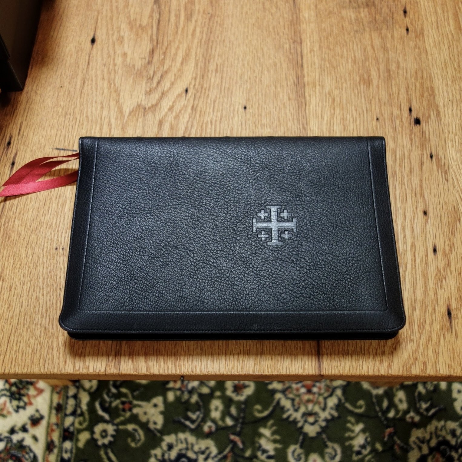
Schuyler Quentel RSV, Full Yapp Black Goatskin Bible
$230.00
In stock
Full Yapp Black Goatskin cover with Red Calfskin liner
3 red ribbons and red under gold art gilt
Page size: 6.1″ x 9.13″ x ~1″
10 pt. font with words of Christ in black
Cross references and Concordance
See Description below for more details.
- Description
-
Description
First Printing
The Revised Standard Version (RSV) is a revision of the American Revised Version (1901) which was itself a revision of the King James Version (1611). The RSV was translated by 32 scholars along with 50 representatives of cooperating denominational bodies. The translation committee attempted to stay as close as possible to its rich Tyndale-King James heritage. “We have resisted the temptation to use phrases that are merely current usage, and have sought to put the message of the Bible in simple, enduring words that are worthy to stand in the great Tyndale-King James tradition.“
Full Yapp Black Natural Grain Goatskin Cover with Red Calfskin Lining
10 point Milo font
PDF sample
Line Matching
28 GSM Paper
Page size: 6.1″ x 9.13″ x ~1″ (155 mm x 232 mm x ~25 mm)
3 x 1 cm Red Ribbons
Art-Gilt edging (red under gold) with gilt line (gold line inside the cover)
Gold embossing on the Spine.
Raised Spine Ribs
Smyth Sewn
Ornamental drop caps
Black letter text (chapter numbers, headers and page numbers in red)
Cross references
Glossary concordance
Presentation pages
Extensive Schuyler Bible Maps - Reviews
-
7 reviews for Schuyler Quentel RSV, Full Yapp Black Goatskin Bible


Patrick Cooley –
I have one review already on Schuyler’s RSV with the Apocryphal/Deuterocanonical Books; it has since become my favorite translation and my favorite Bible. Although I love having the Apocrypha and do reference its books from time to time, I decided to also buy a copy of the Schuyler’s RSV without the additional material. Everything positive that I wrote on my review of the Cardinal holds true here, but this version is infinitely more portable. Since Schuyler didn’t increase the font size and simply removed the Apocrypha from the existing version, the weight and overall footprint of this RSV make it ideal to slip into my computer bag and carry with me. Don’t get me wrong, I do not regret buying the Cardinal; this is not an either/or for me but a both/and. Now, when I am planning to preach from the RSV, I use the one with Apcrypha at the office and have the this one to carry home to continue sermon prep.
Ronald Chastine –
“Received the black goatskin RSV & was surprised at the size and thinness
of this bible. it is very much like the Crossway Omega in thinness & size. A great bible to carry wherever you go. I was torn between getting the RSV with Apocrypha or without & after chatting with Melissa decided on the black without because I liked the red lining. Selection is now limited since many have sold. I wanted red because I have many black bibles, but Red is gone. I will not comment on all the great things about this bible since others have, but if you want a quality (none better) RSV with the beautiful phrasing & language.. don? delay. Restock will not happen till October. If I had not tarried, I could have had red with apocrypha in full yapp. However, this has semi-yapp and is great. Quality is as you would expect & the red ribbons & lining plus the drop caps are a delight to the eye. One last note: love the concordance & maps!”
Kevin Davis –
“See my review below. In short, I love it, and cannot commend it enough. It is by far, the BEST Bible I’ve ever had. And I don’t hand out absolutely half-heartedly. I mean it.
https://kevinrkdavisblog.wordpress.com/2021/10/12/bible-review-rsv-schuyler-quentel/“
Wayne Williams –
With the RSV Quentel, Schuyler has dramatically raised the bar on printing and design. The quality is your typical Schuyler, which is perfection. But with this printing, the bar has been raised. Beware ye of other Bible printers. You have some work to do.
Frederick Kuhl –
“Others have praised the quality of this bible? construction, its leather cover, paper, and colors. All that has been said is true; it? top-notch.
So I?l talk about the text, which is why I bought this bible. It? very readable.
I ?rew up?on the RSV, so what I have memorized is from the RSV. I jumped at the chance to get a well-made bible to resume reading in that translation. Kudos to Schuyler for undertaking the production.
The page is big: about 5-7/8?by 9-1/4? The margins are small; this is not a bible for notes. The references are at the bottom of each page, as are the RSV notes. The result is two large columns of text.
The font apparently is Milo Serif 11 pt, as was used for the Schuyler Quentel NIV. Milo Serif has short ascenders and descenders, which makes the text seem larger than its already large size. (See the Bible Design Blog review of the Schuyler Quentel NIV for a fuller discussion of this.) The result is very readable, easy on the eyes. Like the reviewer I mentioned, I? prefer a single-column setting, but this two-column arrangement seems like it will be great.
As you can see from the text sampler, this bible marks each chapter with both an ornamental drop cap and the chapter number between dingbats. I was afraid this would be distractingly busy, but in practice it? fine. Schuyler chose a subdued red for the ornaments which harmonizes well with the text (and with the inside covers, the ribbons, ?
And the maps. They?e excellent, even better than the maps in my Cambridge Clarion. The bigger page size of the bible means the maps are bigger. And several extend over two pages? can finally actually see where the Apostle went!
I bought this bible to have an RSV that would be easy on my old eyes. It looks excellent.”
Mark Holloway –
Just recieved my RSV without the Apocrypha. Black goatskin with dark red trim is an awesome combination. I really like the drop caps and I especially like the thickness of it. It’s a little thinner than the most recent Quentels. I think I read the print is 10 and the Quentels are 11? If so that would account for it. Its about the size of the Treveris series…..which is also awesome.
Douglas K Vander Brink –
Gorgeous Bible! What I like is that the text type is different than the other Quentels. It is 10pt rather than 11pt, but still very readable. The smaller type makes this noticeably thinner than the the other Quentels also. The Canterbury style drop caps, are a great touch.