Schuyler Quentel NASB, Full Yapp Black Goatskin Bible
$245.00
Out of stock
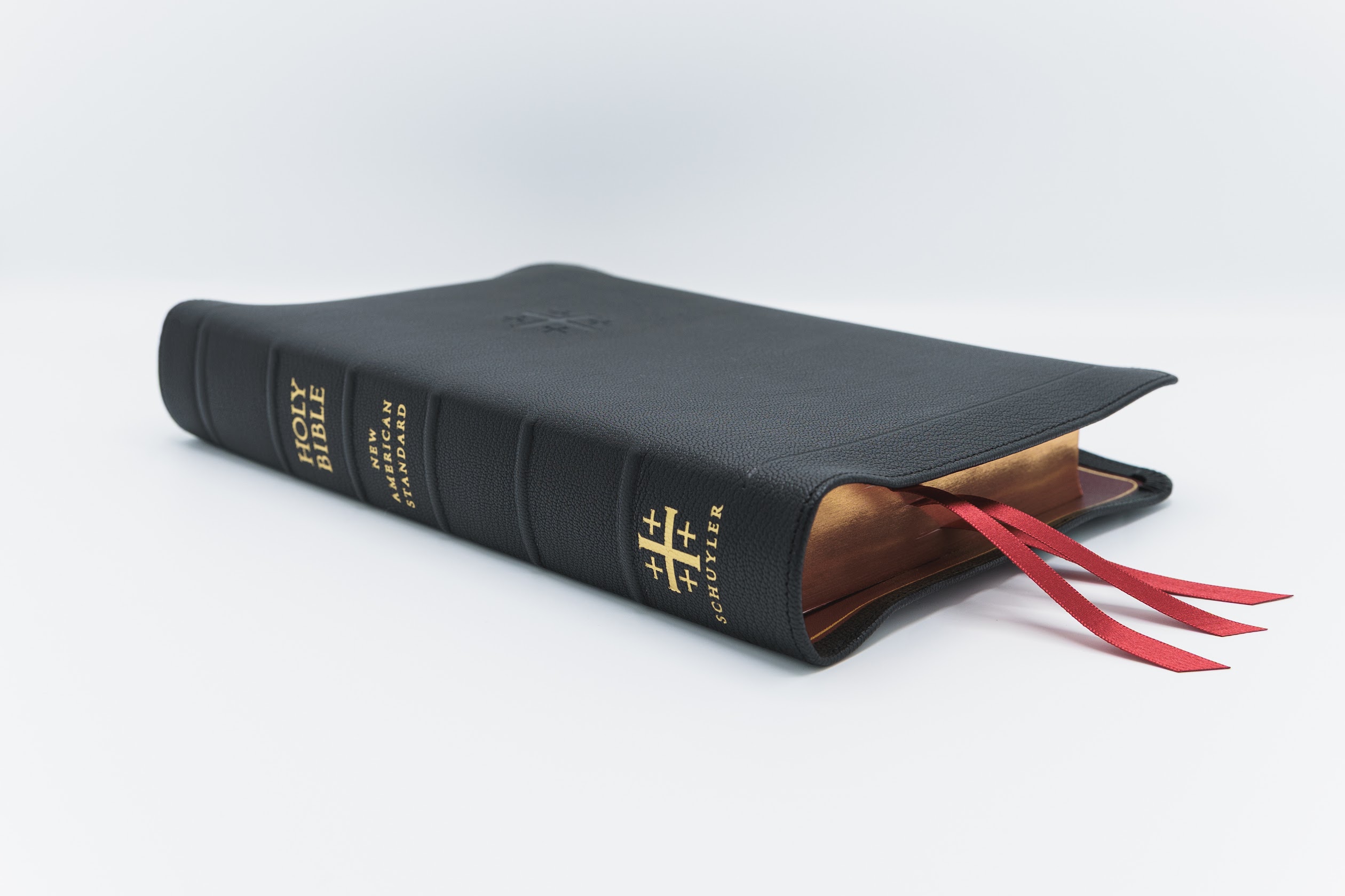
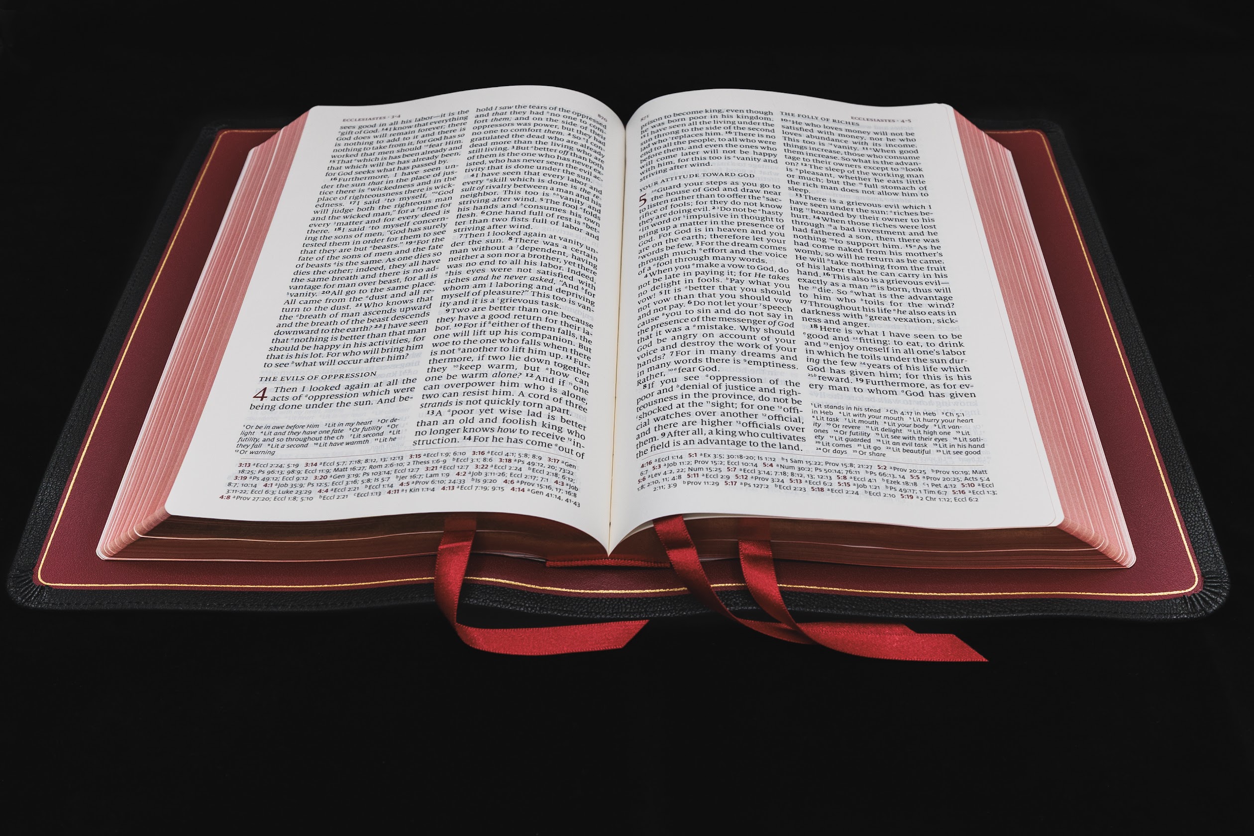
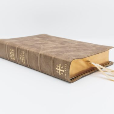
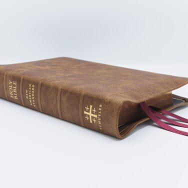
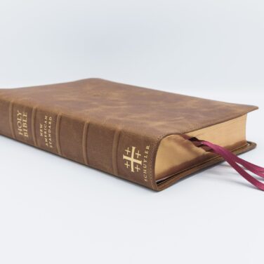
Full Yapp Black Goatskin cover and Red Calfskin liner
3 red ribbons with red under gold art gilt
Page size: 6.1″ x 9.1″ x 1.5″
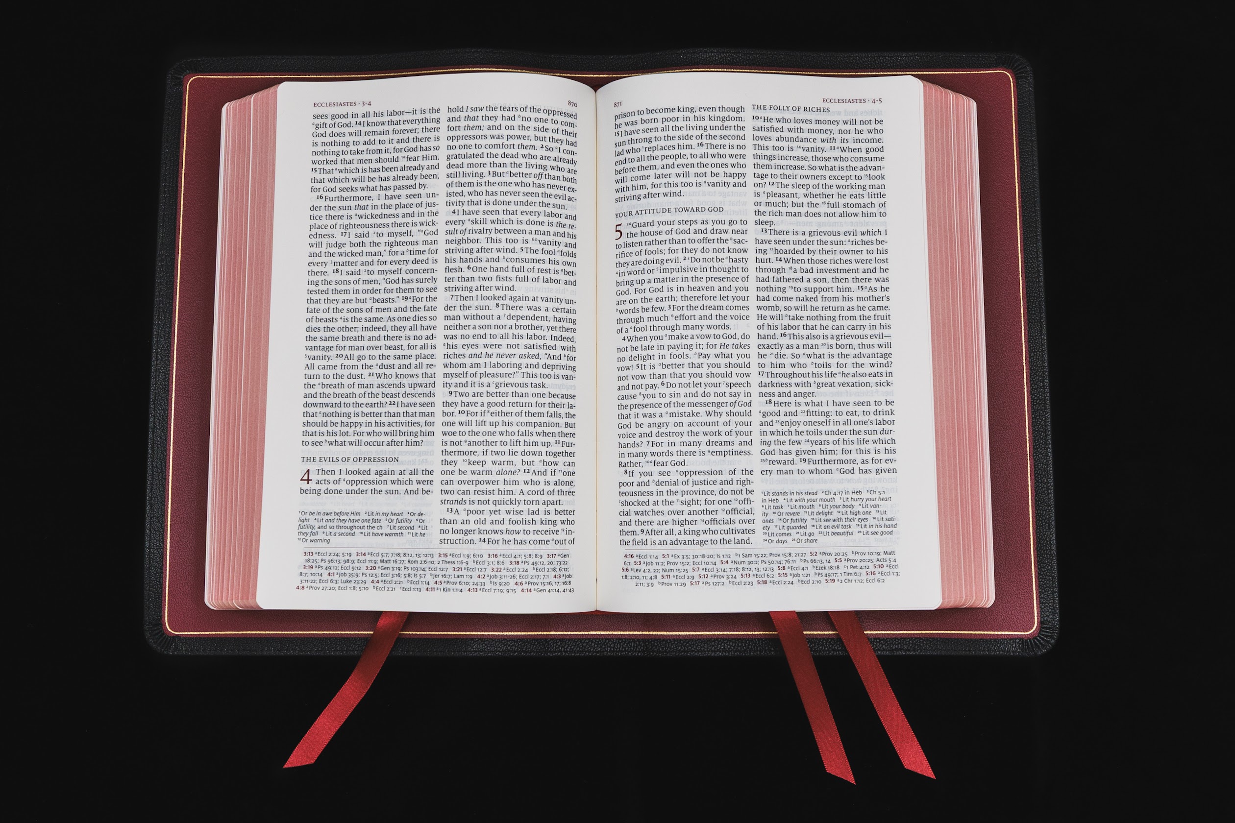
11 pt. font with words of Christ in black
Cross references and Concordance
See Description below for more details.
Receive a notification when this product is available.
Description
Description
Full Yapp Natural Grain Black Goatskin Cover with Red Calfskin Lining
11 point font
PDF Sampler of the interior
1995 text
Line Matching
36 GSM Primabible Paper
Page size: 6.1″ x 9.1″ x 1.5″ (156 x 231 x 37 mm)
3 x 1 cm ribbons (Red)
Art-Gilt edging (red under gold) with gilt line (gold line inside the cover)
Black letter text (chapter numbers, headers and page numbers in red)
More than 95,000 entry cross references and about 17,000 translation footnotes
Presentation and Family Record Pages
Concordance
Exclusive Schuyler Bible Maps
Rev. Steven (verified owner) –
Perfection! Beautiful, premium Bible. Superb craftsmanship. 36 GSM Primabible paper!
Schuyler makes the best premium Bibles!
Judy (verified owner) –
This is a short and sweet review! First, it was extremely well packaged for shipping with lots of care! The quality is always top notch and I have several ! I love the 11 pt. Font and the weight of the paper. Schuyler, in my opinion, makes the finest quality ! Thanks!
Pastor Wayne (verified owner) –
The craftsmanship and materials Schuyler uses for their Bibles are unmatched in the American Bible publishing industry. I’m so very thankful for the limited return of the NASB95 Q with 36gsm paper ~ the perfect Quentel.
Thank you Schuyler Bibles and Evangelical Bible!
Blessings!
Pastor Wayne
John 10:27
Mark Inscoe (verified owner) –
I just got my Bible in today and it is beautiful! Zero complaints! I will treasure it for the rest of my life.
Jacob Simmons (verified owner) –
This Bible is extremely well made. The main competition would be the Allan R1 NASB, however I believe this one is superior. The main thing I was nervous about was the 28 GSM paper. I can tell you with confidence that the paper is quite amazing. The line matching is superior to other bibles I’ve owned, and I did not notice much bleed through. The paper is quite light, but as will all bibles, treat them respectfully. I do not feel like I will tear or crease the pages, and they are as smooth as silk.
GOAT skin is very nice, not too floppy or stiff, and can open flat pretty much right away. My Bible came with the yap already trained (thank you). I’ve gotten multiple complements on this Bible and it is small enough for me to take to church, but big enough for it to be my desk reader. I doubt I’ll ever have to buy another Bible. The Quentel layout is amazing. My brother prefers ESV over NASB, so he is getting the ESV version of the Quentel since he loved the layout so much. The text is such a joy to read and easy on the eyes! There are plenty of premium bibles out there, however, I firmly believe the Quentel is the last stop for those looking for their perfect Bible. I will not choose another type of Bible other than a Quentel unless they stop production.
DJC (verified owner) –
If you love the NASB-95 translation, grab one NOW!
I recently ordered this NASB-95 (my favorite of the NASB editions) Bible because I was afraid the 95 version would be discontinued because a newer version is now out. It looks as though my fears were well founded and they are now on liquidation. I could have saved a few dollars had I waited, but I’m glad I ordered it when I did. I am sorry to see the wonderful 95 edition go, as I much prefer it to the newer one.
This is my first full yapp Schuyler and it’s a beautiful Bible. The black with red is very classic for a classic and accurate translation. I’ve not had time to use it and I may save it to gift my son (his favorite is the NASB and I’ve given him the personal size), but I’ve noticed no pages with lighter print so far. The leather is beautiful. The paper, binding, and ribbons all appear to be excellent quality. I highly recommend this Bible and this translation; get one before they disappear. They’re even on sale, but not for long.
asagraphics –
Ya’ll… Ya’ll… Let me tell you. I have been waiting for SO long for this edition and have always loved the Quentel layout. I cut my teeth as a young Christian on the NASB 95 and have wanted a full yapp edition since Schuyler started doing them. I was so disheartened when they released the silver gilted version last year. To me, the NASB 95 is such a scholarly and traditional translation that silver gilt and sans-serif fonts should be avoided at all costs. The later was not a problem for the Quentel, but man… red under silver… *queue the world’s smallest violin* When I learned they were finally doing a red under gold, I was beside myself! I rushed to order one, and let me tell you… ya’ll… ya’ll… They have just about perfected my dearly beloved NASB 95.
I wanted to share some stats that they don’t mention above, but just be aware that these things might change between runs, if there is another run. It has:
• Curved text block – to help lift the text out of the gutter and minimize that bowing out that text blocks love to do when heavily used.
• Raised spine hubs… Now I know it says it above, but one the Schuylers I purchased had mere rib indications (not acceptable! :D). These babies are RAISED… like small strips of leather added under the cover to lift the hubs up even more, RAISED.
• Pleated corners – they beat the pants off of the cut corners. Whoever is doing these pleats was on their A-game when they did this one.
• One-piece liner! It’s the little things that I notice, and Schuyler’s main direct premium Bible competitor uses a 2-piece liner, then tries to hide the split with a goofy-looking tab. Yeah, no thanks. Schuyler didn’t skimp and gave this one the single piece liner it deserves.
Really… truly… it’s a beautiful edition. The only way I’ll buy another NASB 95 is if they do one in a 36 gsm paper. Schuyler, I’m not sure why you’re so hesitant. You know your fan base would eat up some 36 gsm. Bring it back as the standard for the Quentel, bump the price up accordingly, and save the 28 gsm for your thinline editions. Also, an MSQ would be great! (Mid-Size Quentel with a 9.5 font).
Really thank you all, I’ve had nothing but great experiences with your company. God is doing great things through you all, and I hope he continues to bless your endeavors.
einar –
I got this Bible today and I am speechless actually. This was above what I expected. I realize now that cameras can’t pick up the quality of these Bibles, and I finally get what the reviewers are talking about. The feel of this leather and binding and paper. The paper is thin, but highly opaque. The combo of the red liner with the black and gold – for me this is just perfect art. And it’s just perfect made in all details this Bible. Really something. And the deep red art gilt… and what I’m probably gonna enjoy the most over time, the quality of this print. This was really crisp and good print. I will never regret this investment, and I doubt now it will be the last Schuyler. I was a little afraid for smell because of another’s review here, but mine smells just wonderful and perfect leather. Exactly how it is supposed to smell. Forever thankful! And superb service!
Rev John Wilderspin –
Read the other reviews already posted & l must say, my NASB full yap has no nasty small & the paper, at 28 GSM, is just fine, thank you very much. Looking forward to acquiring a premium NASB ‘20 when such a thing appears.
jasonhowdle –
I just received my NASB Full Yapp in black goatskin. Before I get to my review, I must point out I have purchased quite a few regular size Schuyler Quentels and have been extremely satisfied. So writing this review is somewhat troublesome for me.
This Full Yapp version upon arrival was regretfully below my expectations. I have seen other reviews where people complain about how bad the odor is from their new Bible. I always thought that was nonsense. Then this NASB arrived. WOW, I could smell it before I even opened the box. It isn’t a pleasant new leather Bible smell either. I am sure that will dissipate with time, regardless there is a smell like I’ve never experienced before.
The leather on this copy is not very soft and holds very little character as compared to my other Quentels. I was quite surprised by this, I expected a leather cover on par with my previous editions. I am sure however with continued use it will soften up and break in after time passes. One of the pleated corners isn’t the best (a bit sloppy) and the stitching on the parameter is loose where it has been tied off. I can live with these minor imperfections, just feel they are worth pointing out on this review.
These issues are solely stated for my copy. Iknow other copies out there are probably better, this particular one did not quite meet the mark in my books. The issues listed won’t dismay me from future Schuyler Bible purchases. Maybe my expectations were too high for my first Full Yapp Schuyler Bible? But, when it is placed beside my 53 Allan Longprimer for comparison. I feel my above description and observations are accurate.
Even though my copy wasn’t what I had hoped or expected, I would still recommend it to anyone. It is a fine Bible that can be enjoyed for many, many years.
Michael R. Drapp –
For those of you who have been waiting for Schuyler to produce an edition that feels and reads like your R. L. Allan Bible does; your wait is over! Imagine my joy when I found the natural grain goatskin cover to be truly a full yapp cover. Yes, the yapp is actually a bit wider than on my Longprimer 53 and it completely covers the text block all the way around. The grain on the goatskin is more pronounced than on the other goatskin Schuyler Bibles that I own; it is almost as pronounced as the R. L. Allan natural grain goatskin but not nearly pronounced as much as Allan’s Highland Goatskin. The goatskin feels much softer than either the Allan or Schuyler goatskin covers that I have handled in the past. It also feels a bit thinner and the edge-lined hinge seems quite a bit stiffer than what I am used to. The perimeter stitching was good but not perfect in my example; having a few stitches that were just a tad loose with some overrun. The silver gilt line was very even and the text block well centered. To my surprise, the corner work was absolutely beautiful, the best that I have ever seen in a Schuyler and better than most of the R. L. Allan Bibles that I own. The 28 gsm paper does have some ghosting and feels thin, but the read and opacity is about the same as Allan’s 36 gsm offering. I would not want this Bible to be thicker or heavier and the 28 gsm paper will work just fine if you are careful in turning the pages. Without question, this is the best Schuyler Bible in my collection and with construction equal to R. L. Allan’s current offerings at about 80% of the price, this is the best value to be had today in full yapp. I recommend that if the NASB is your translation of choice (as it is mine) that you purchase this Bible without delay; they will not be in stock for very long.